“An Accident” (2022) Short Film Case Study
Project Announcement
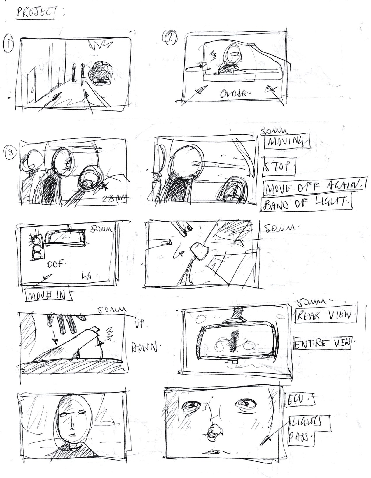
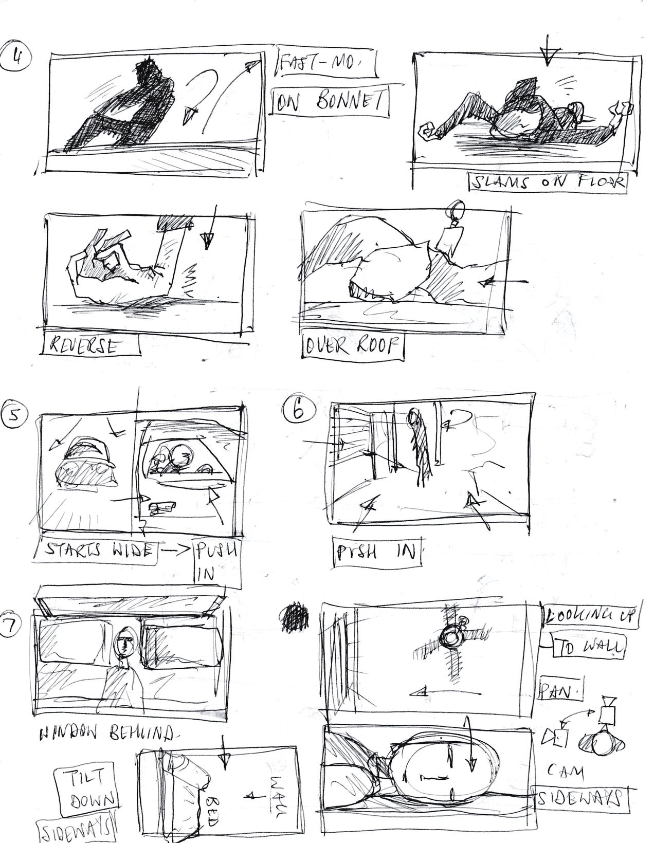
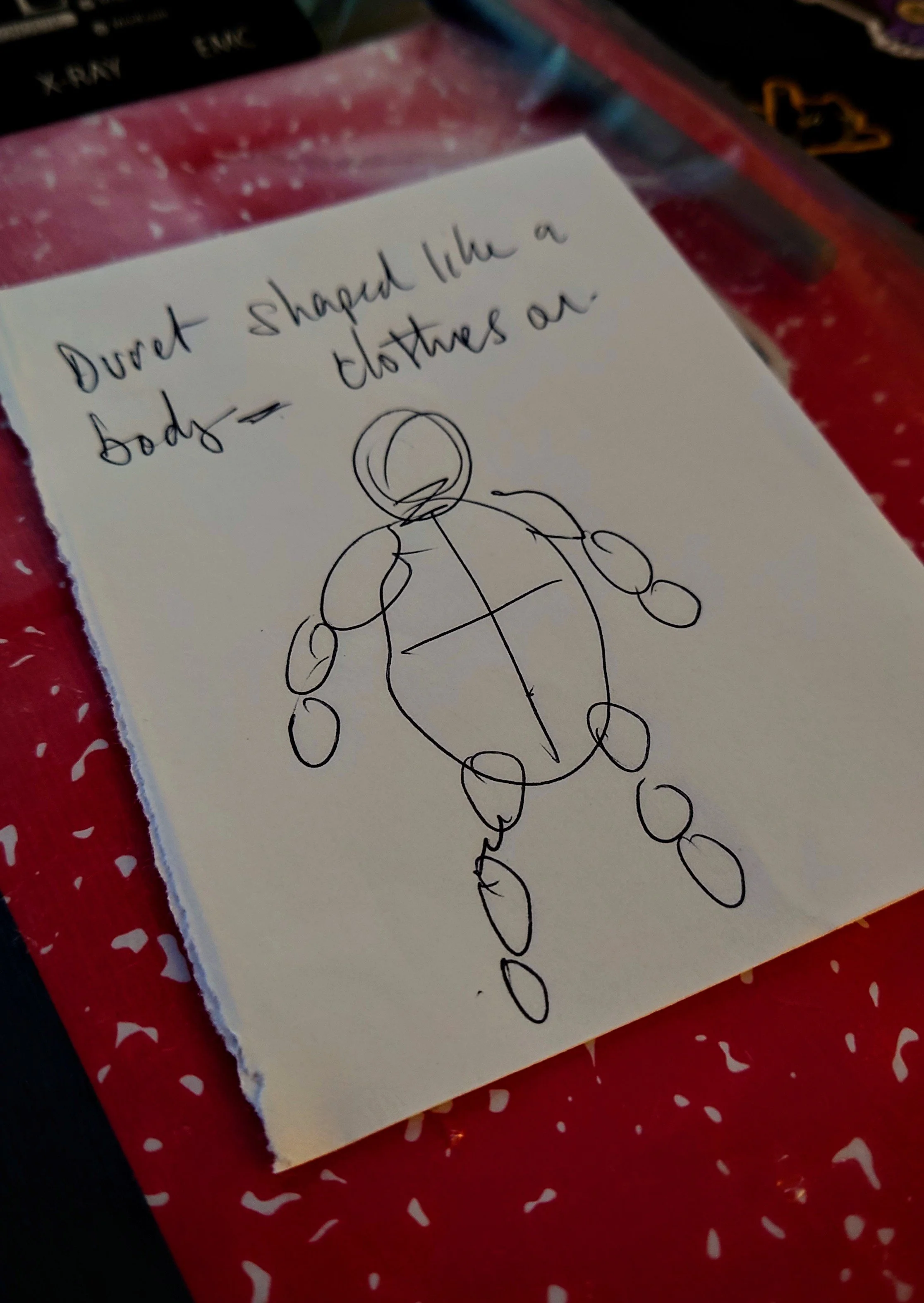
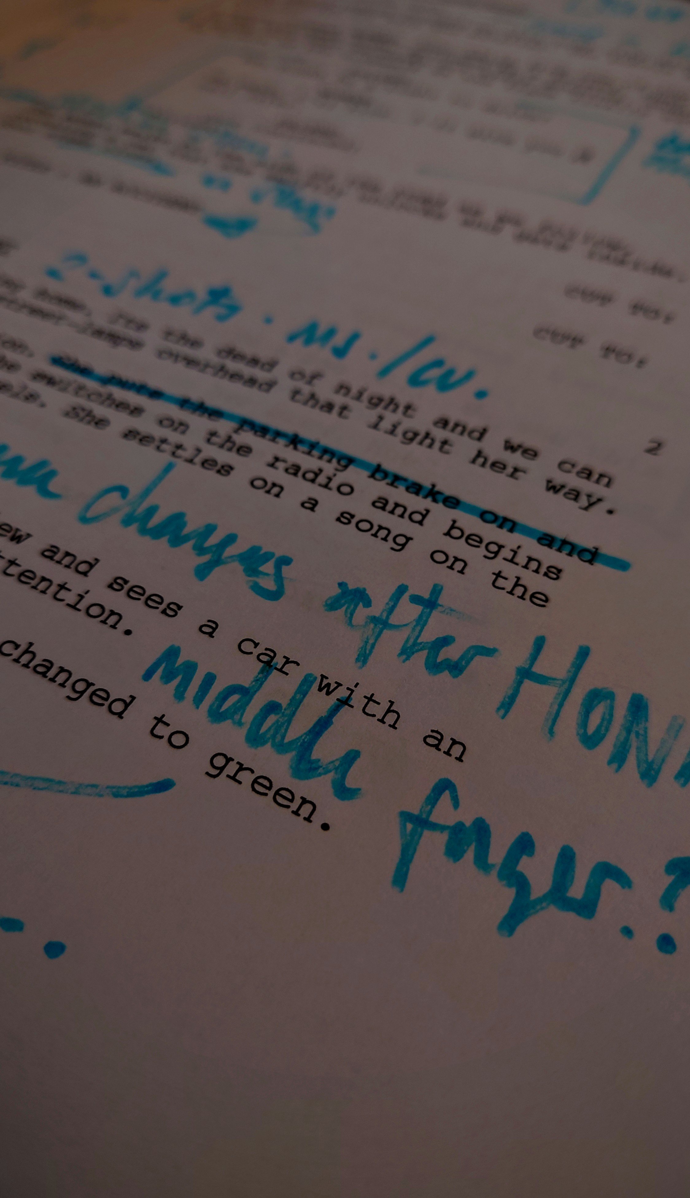
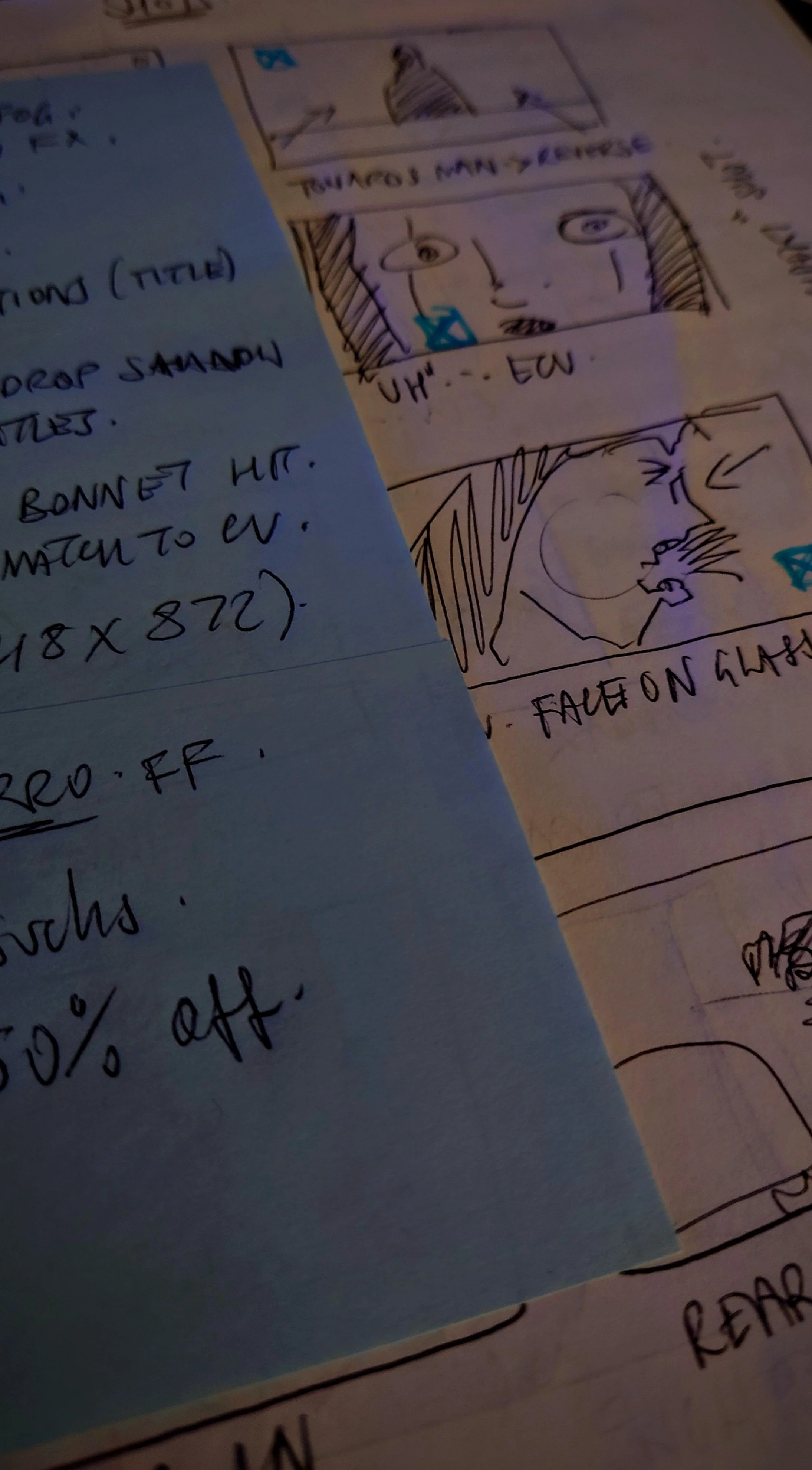
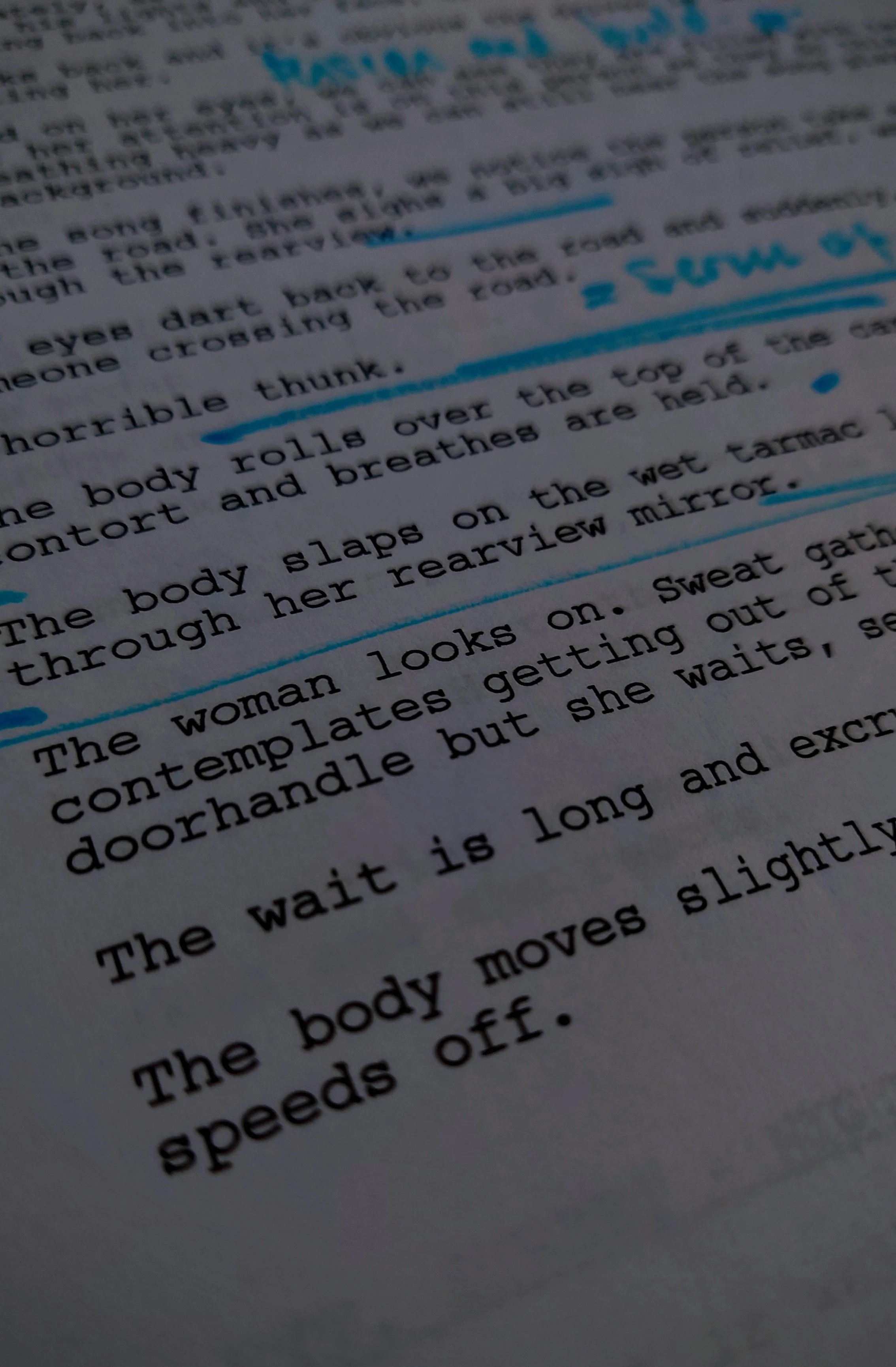
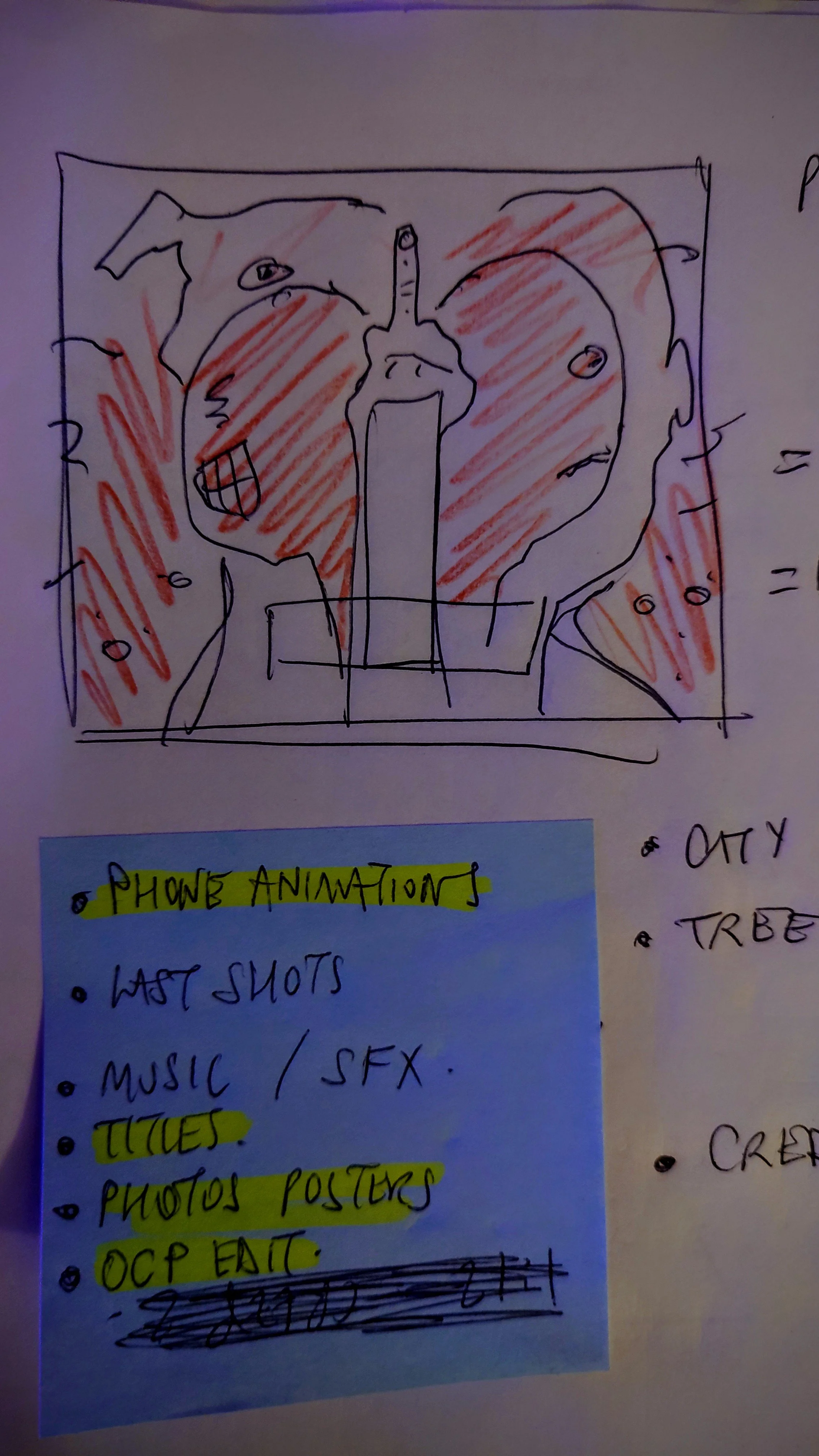
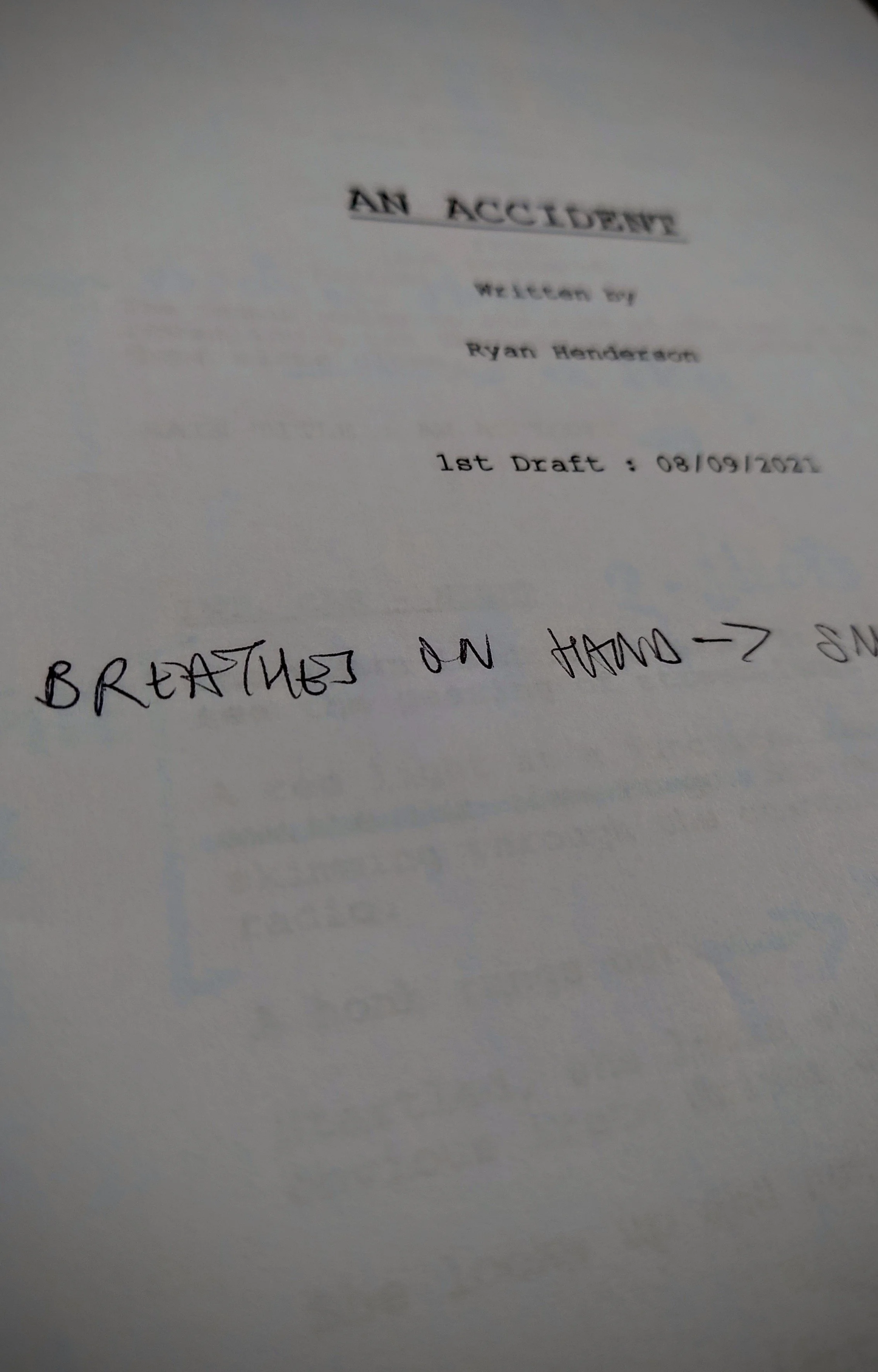
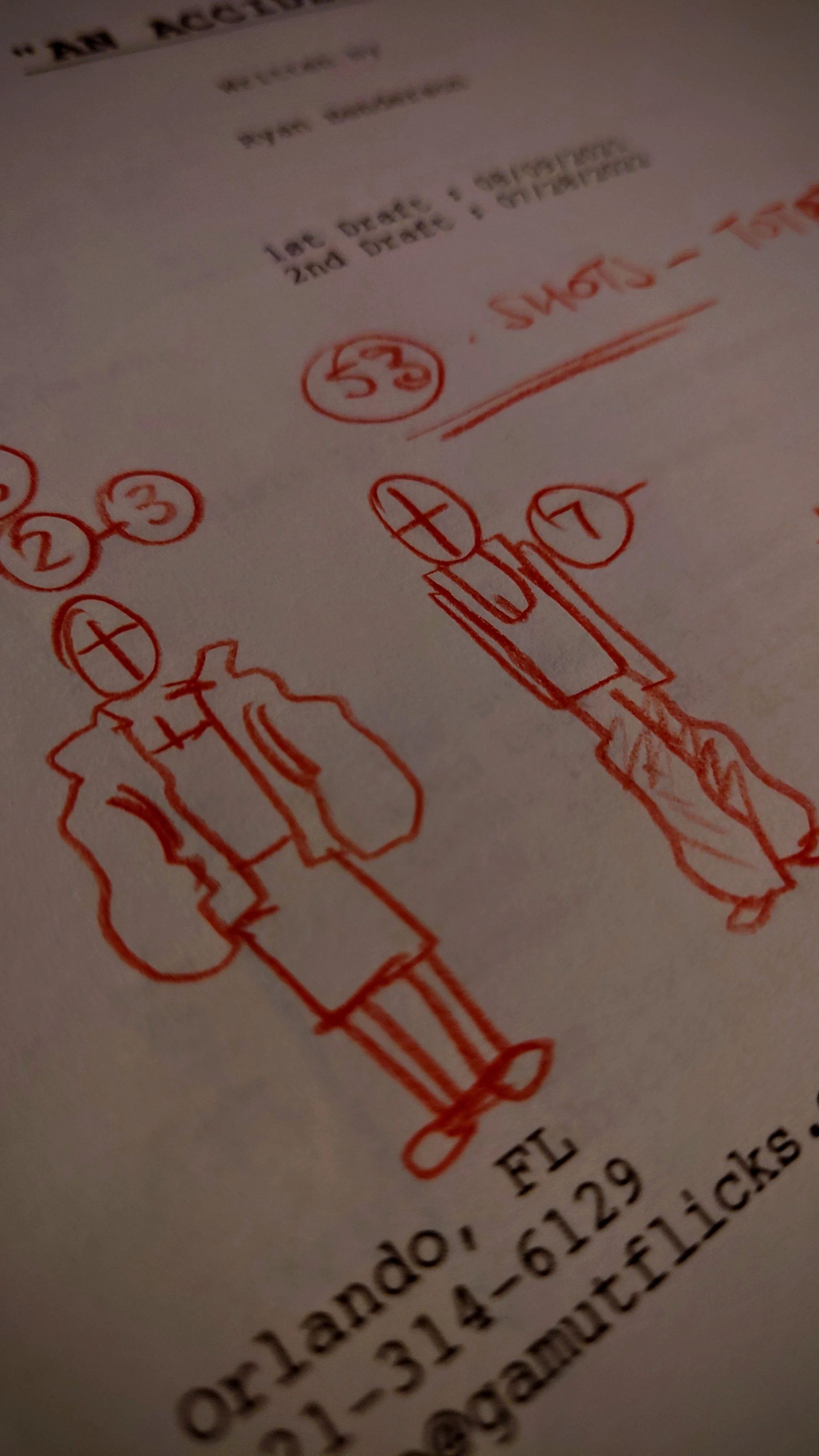
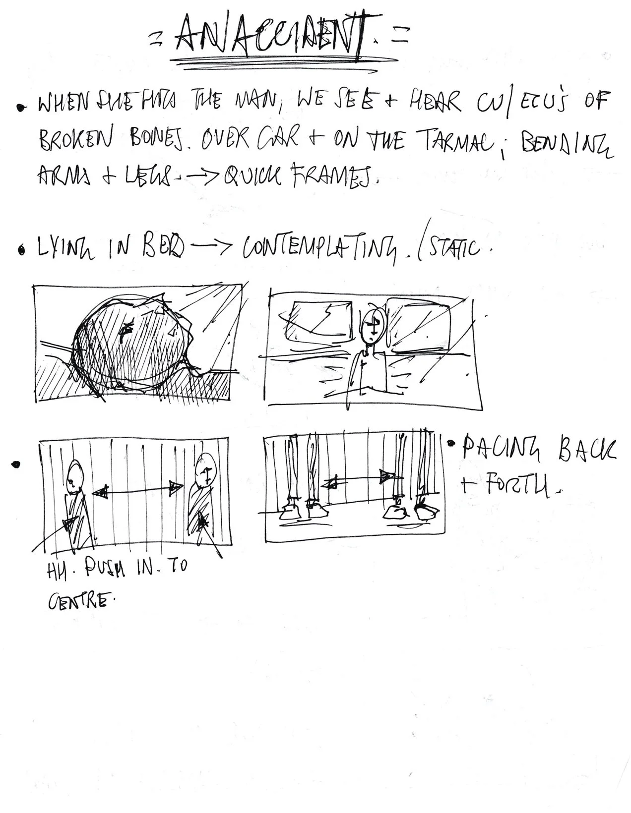
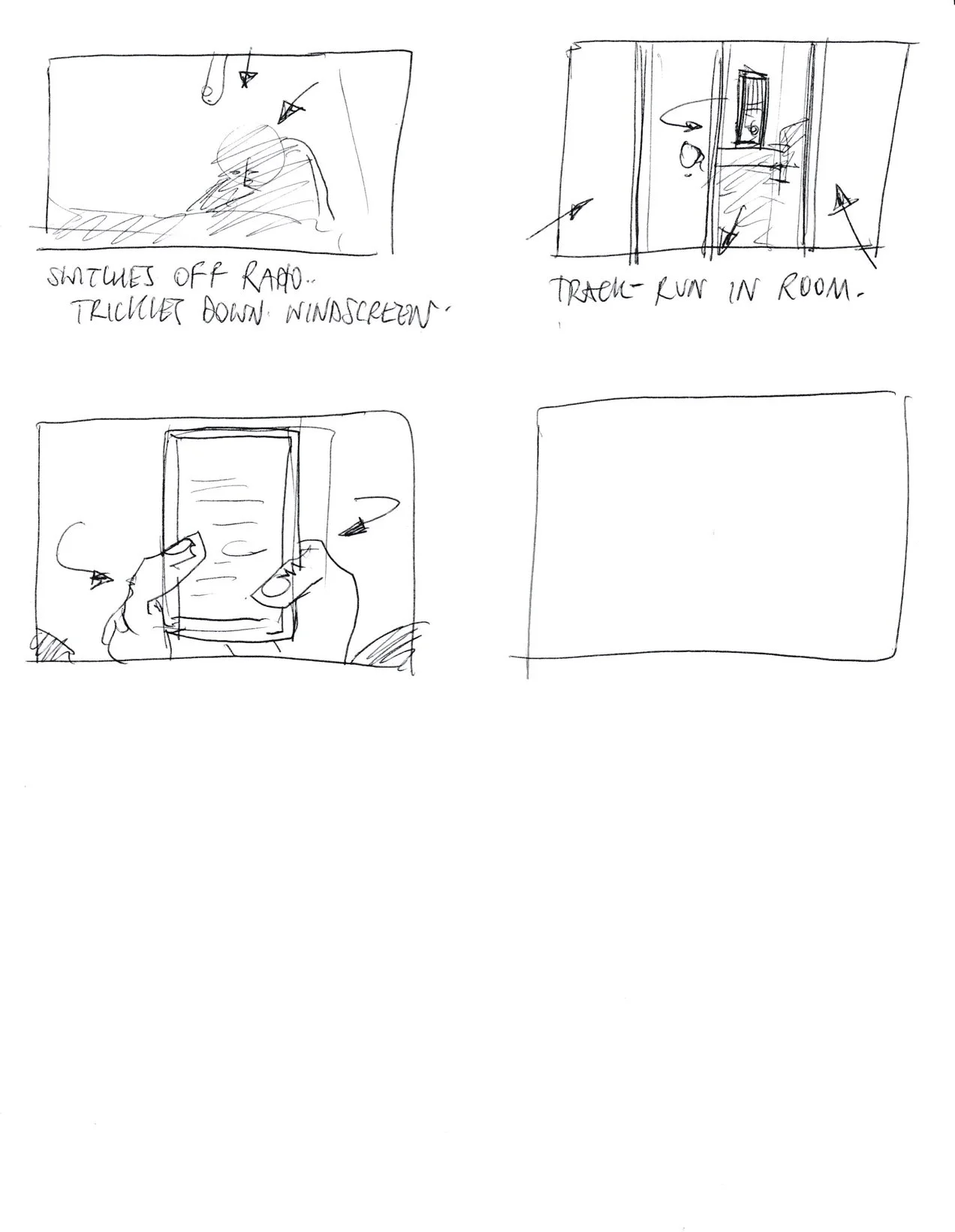
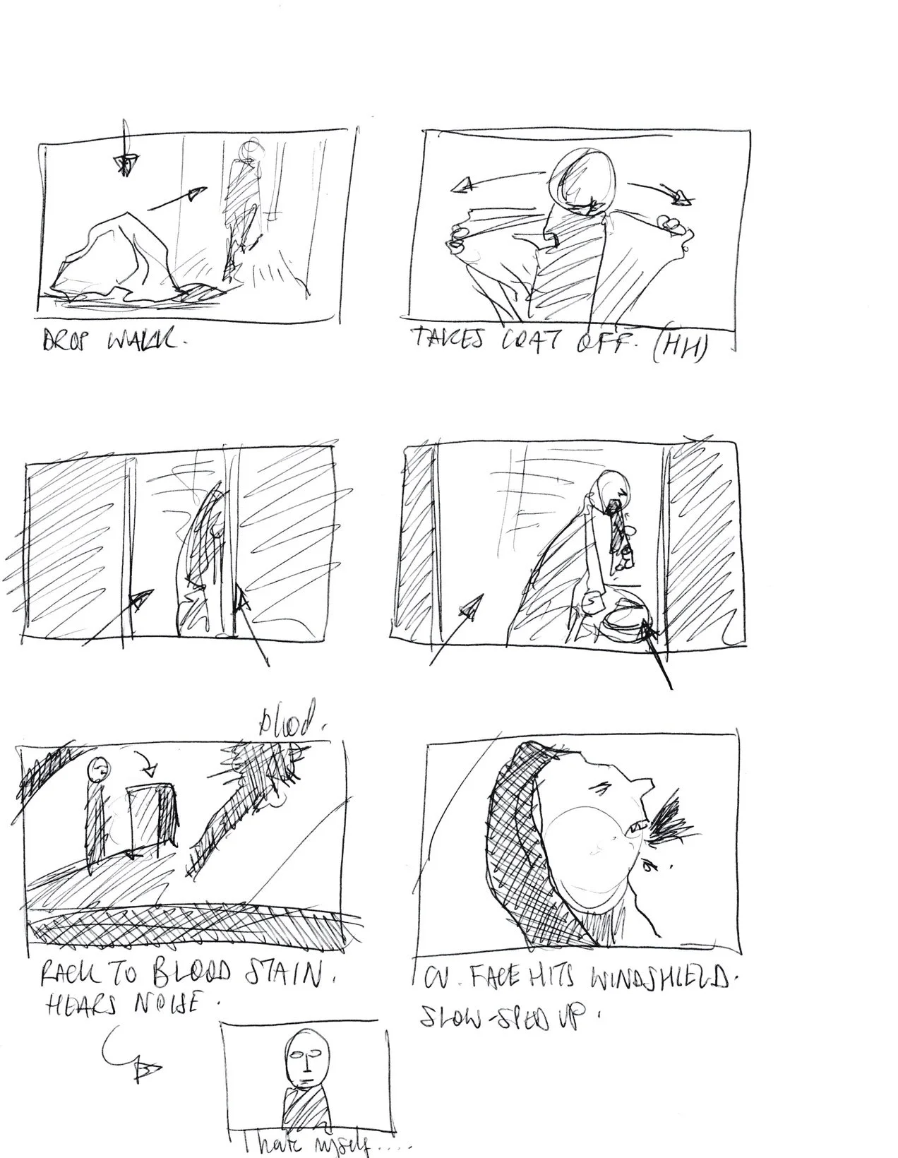
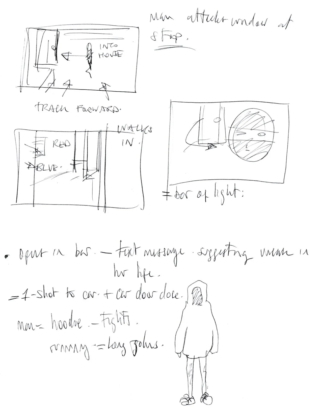
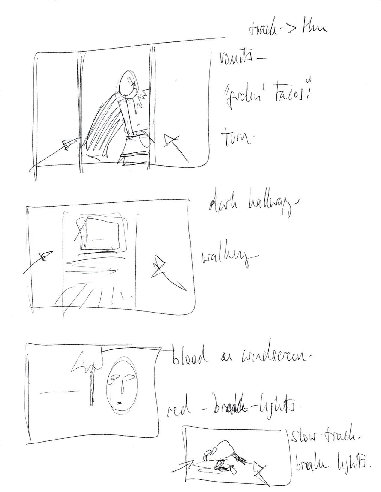
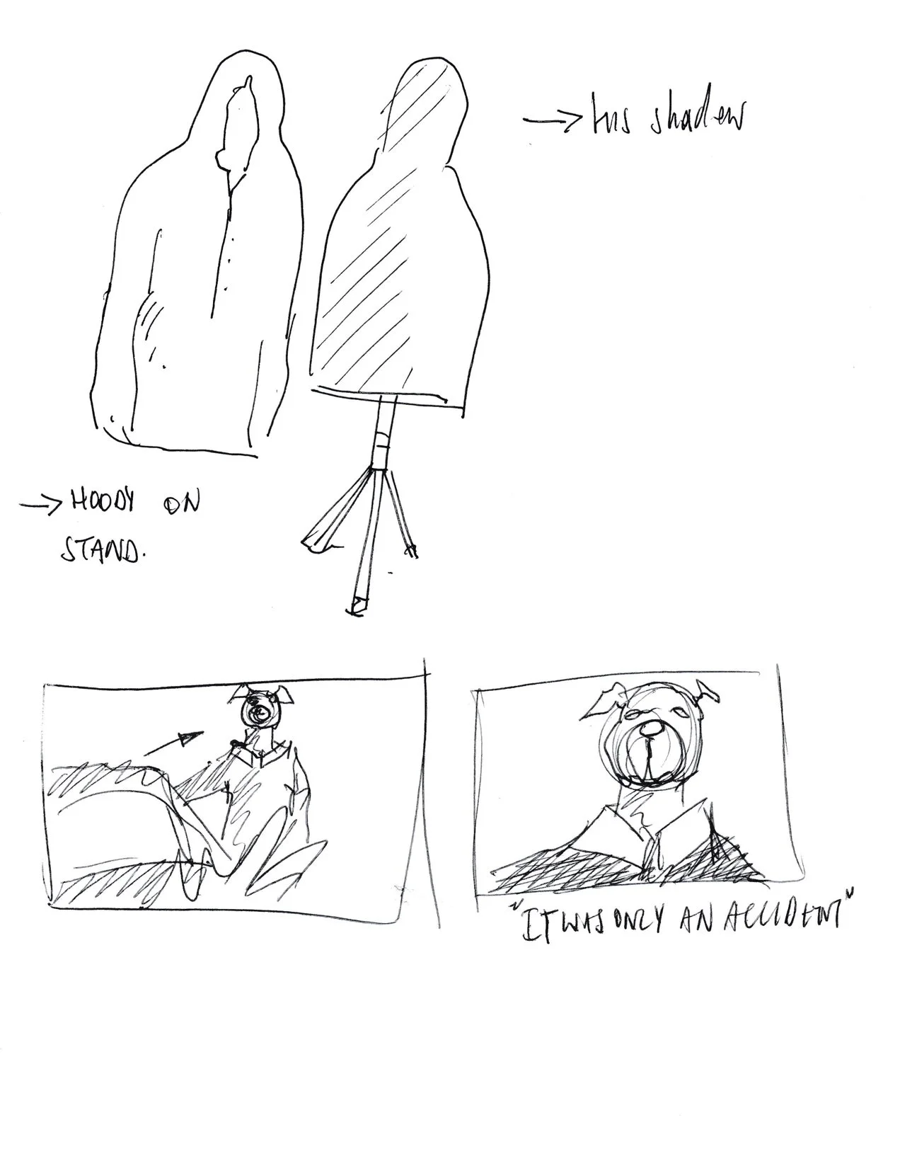
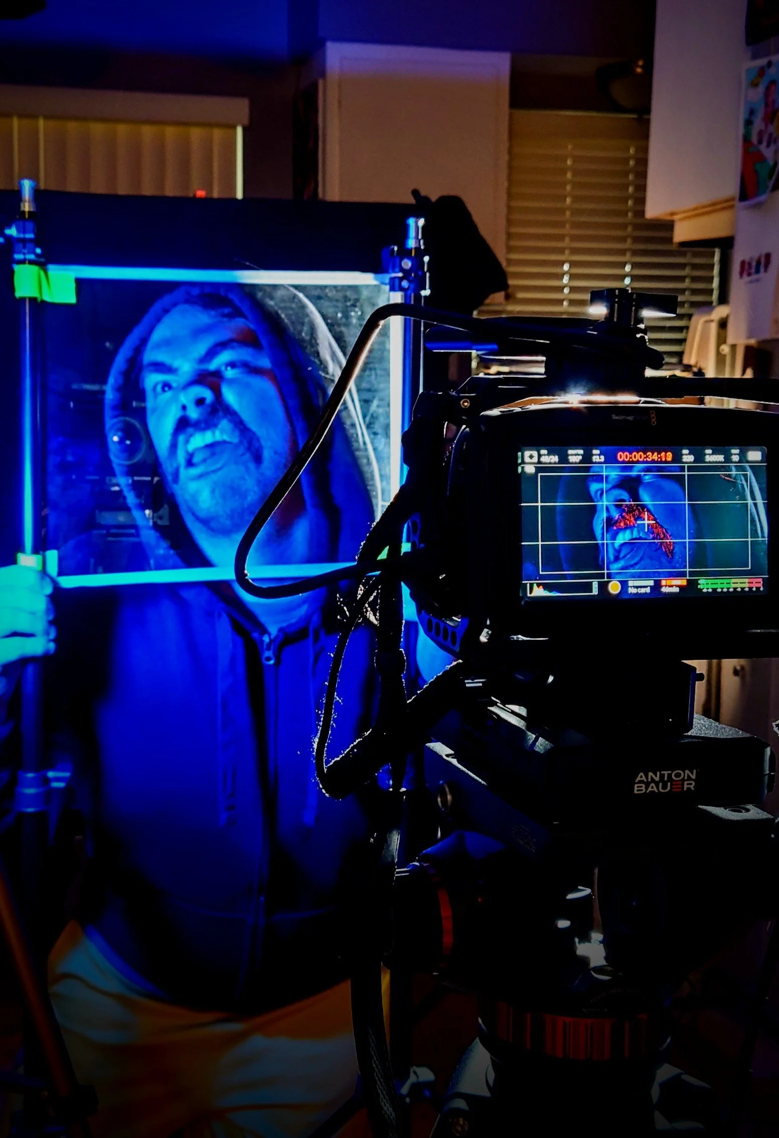
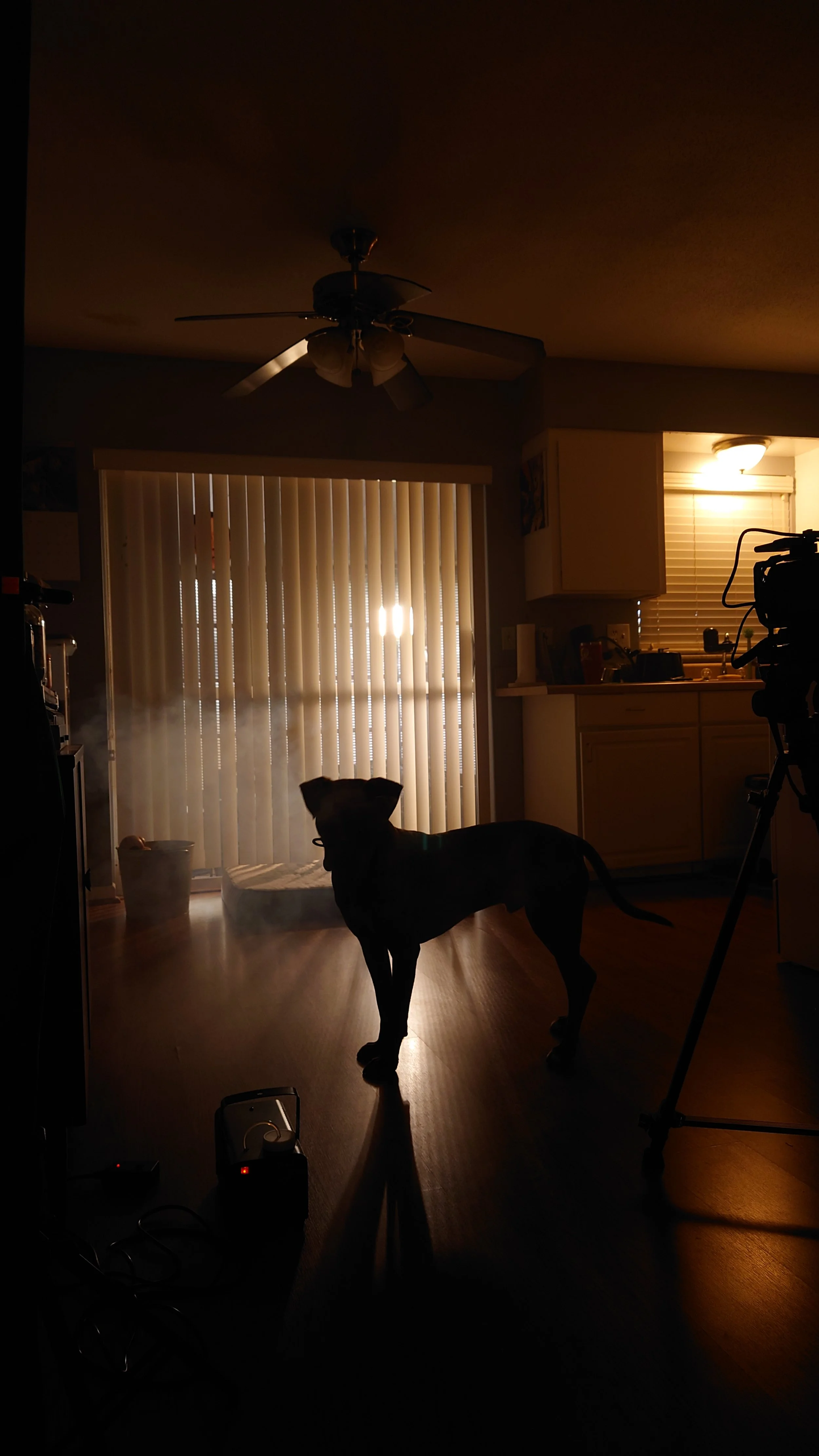
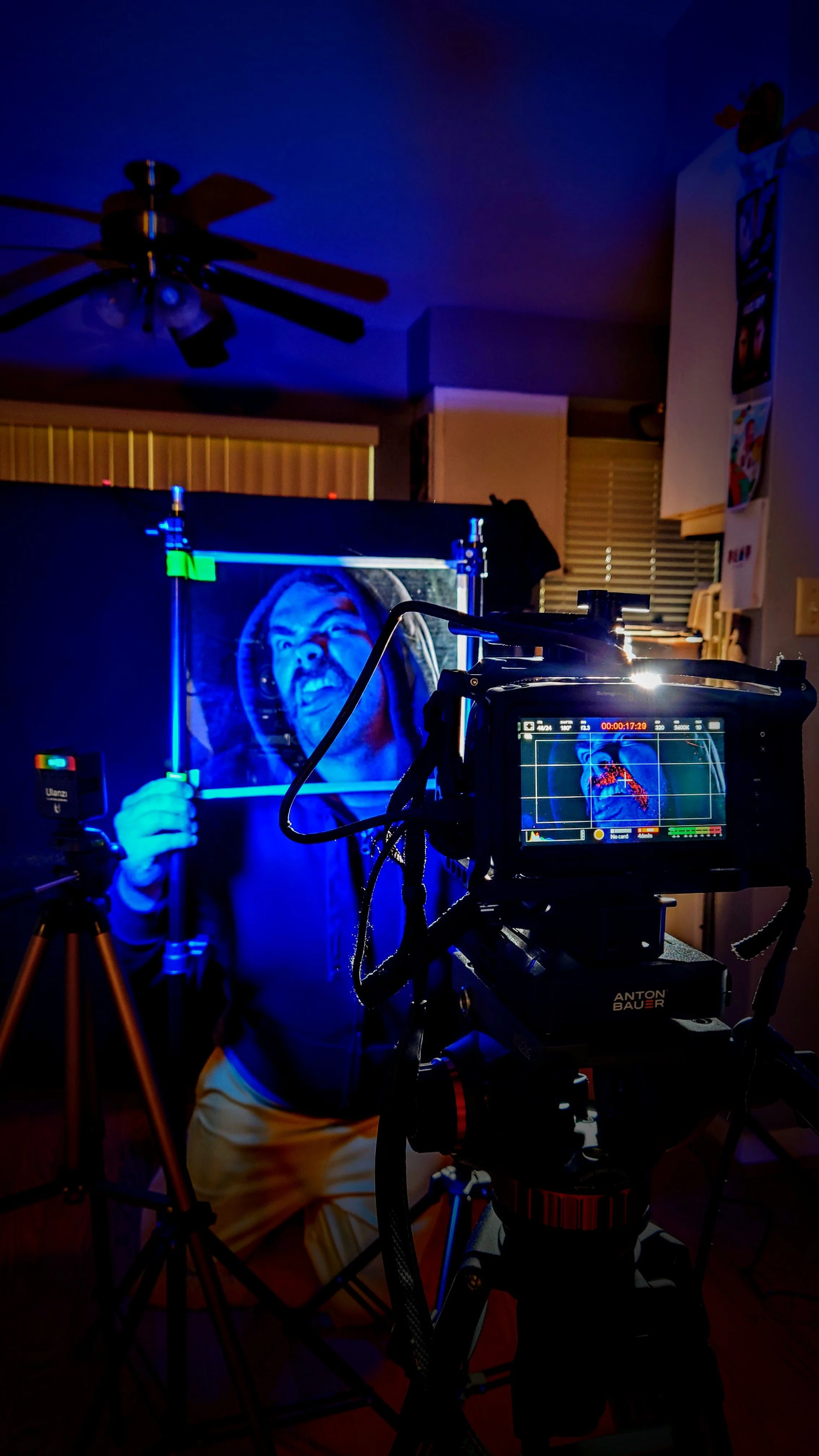
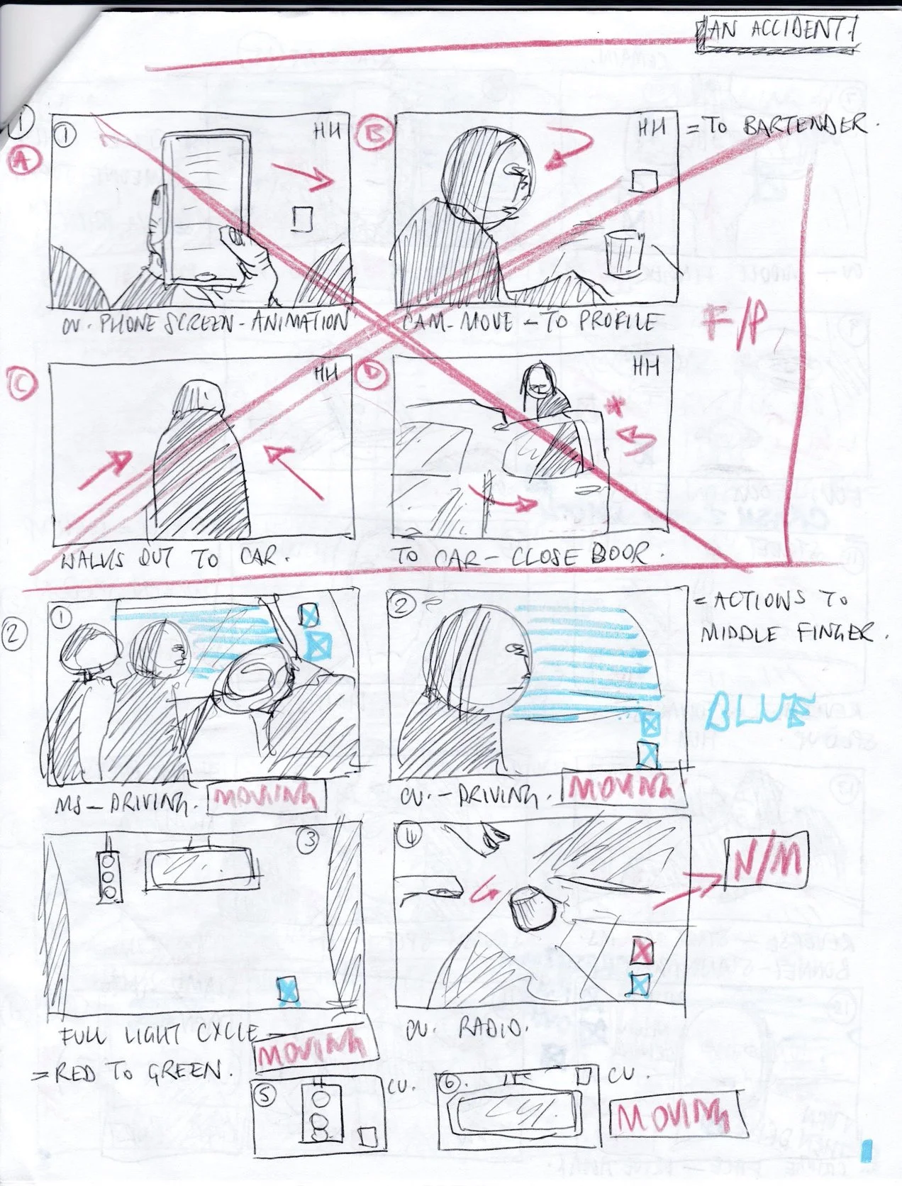
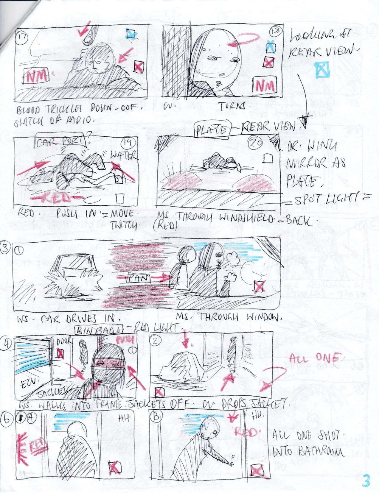
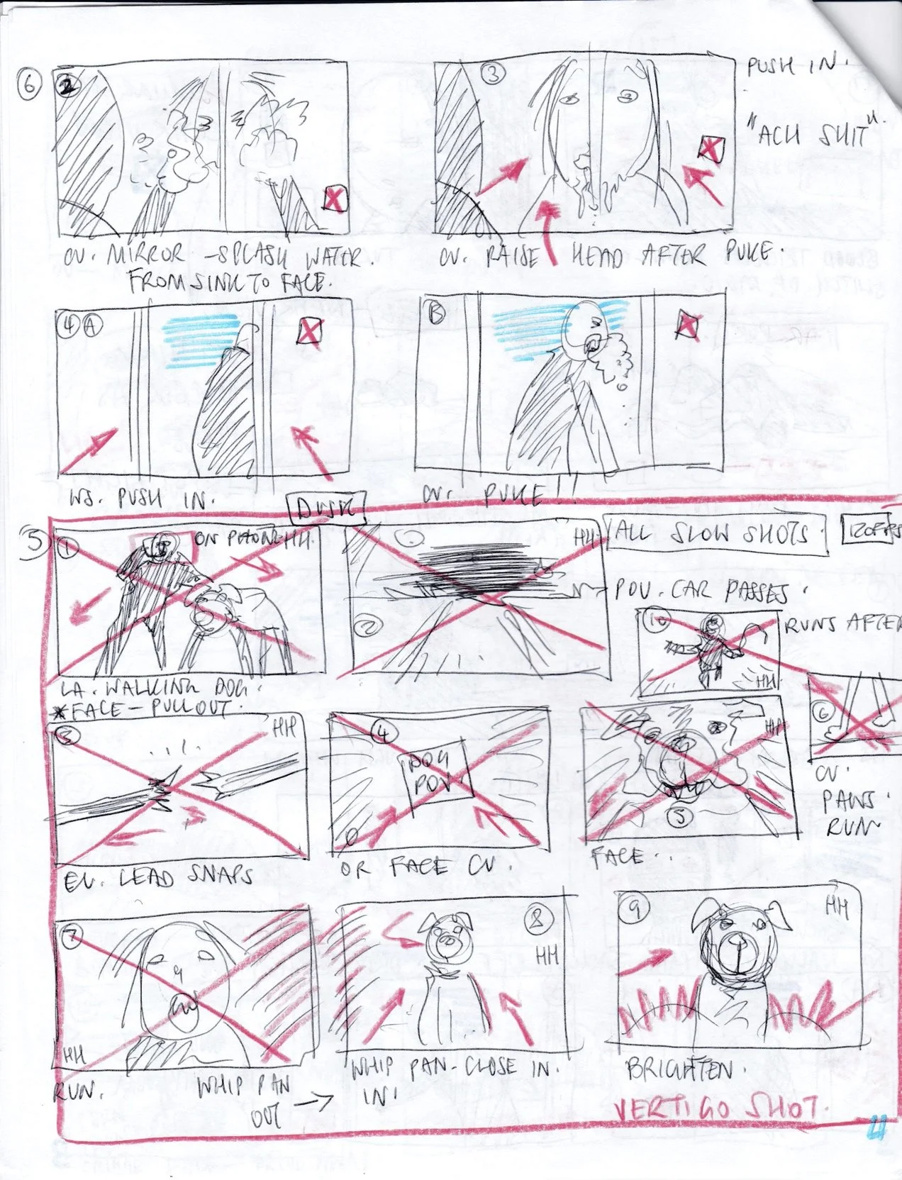
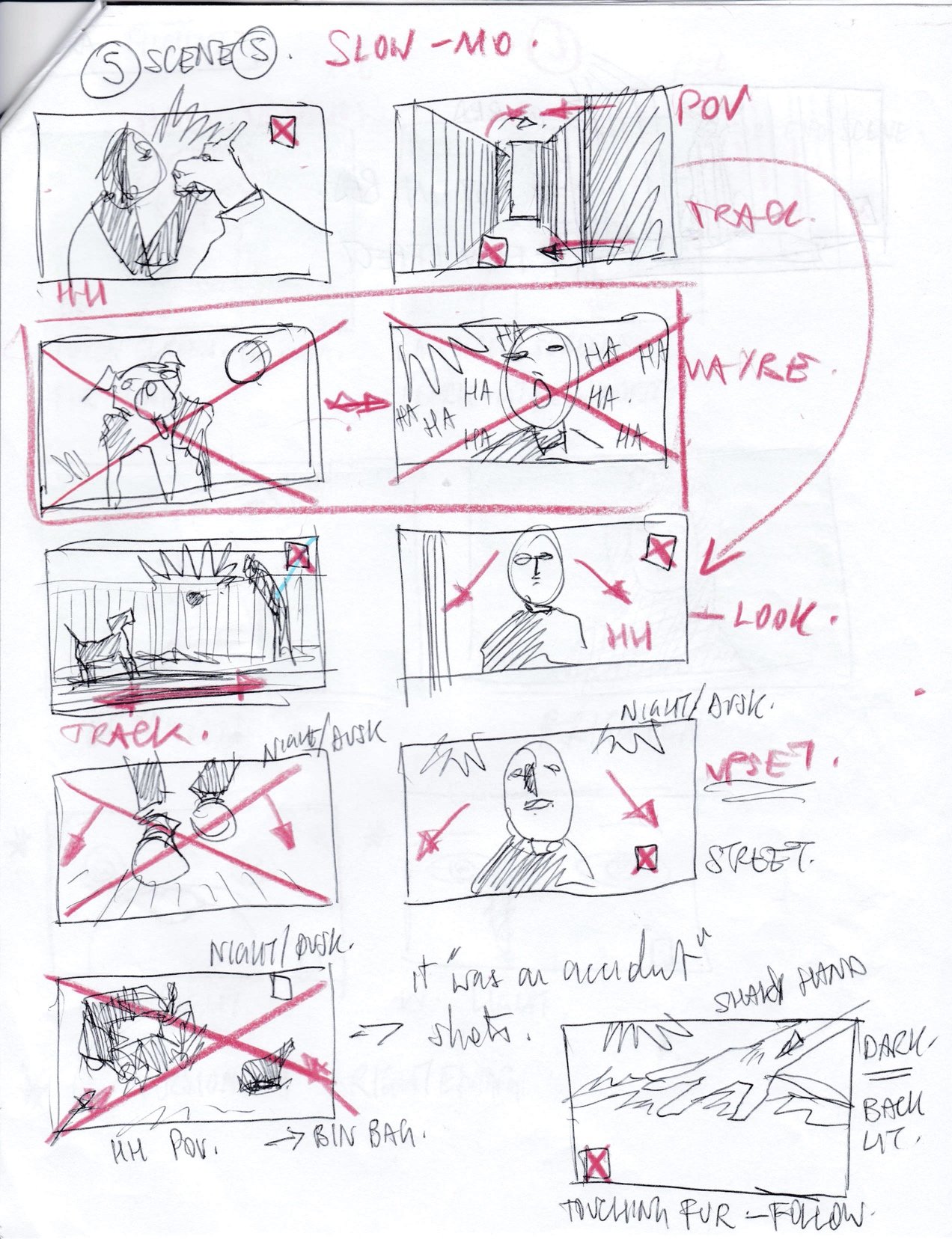
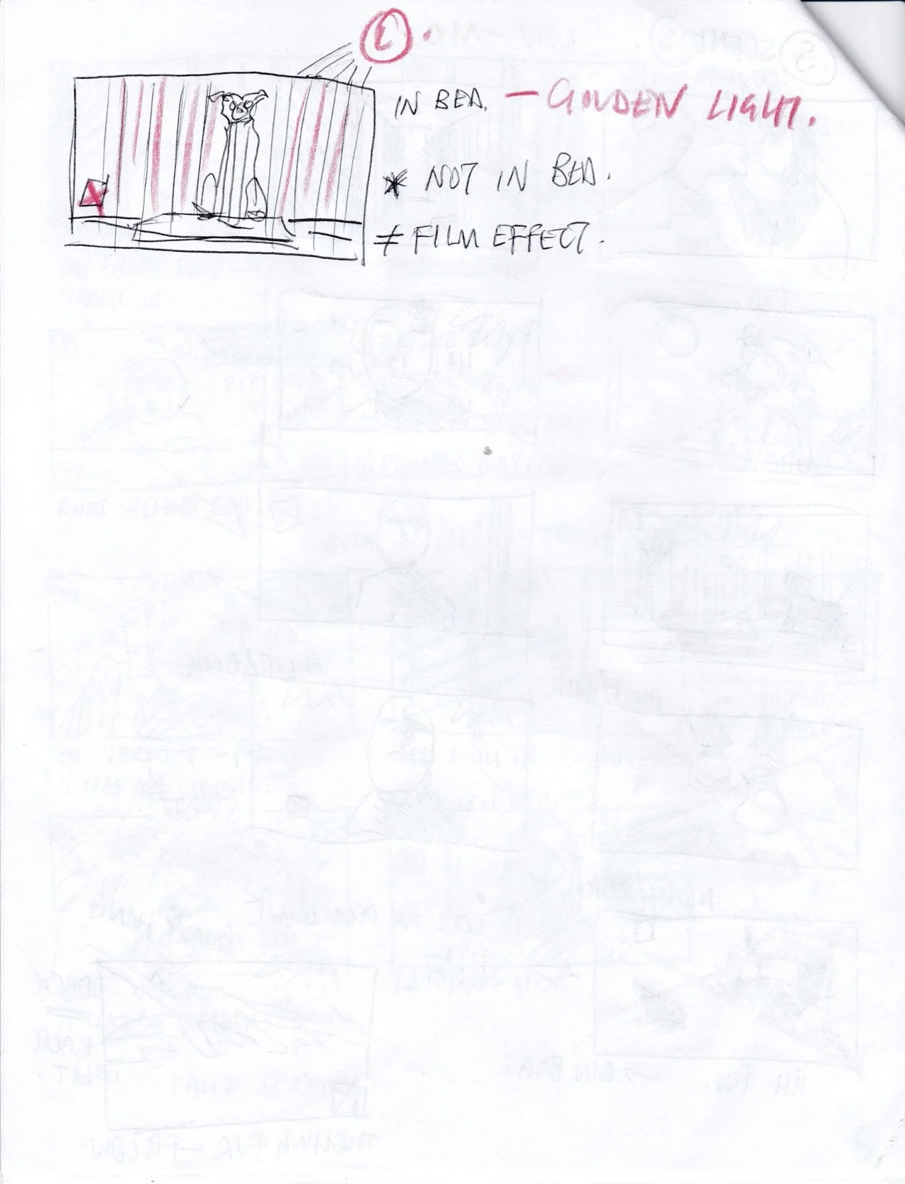
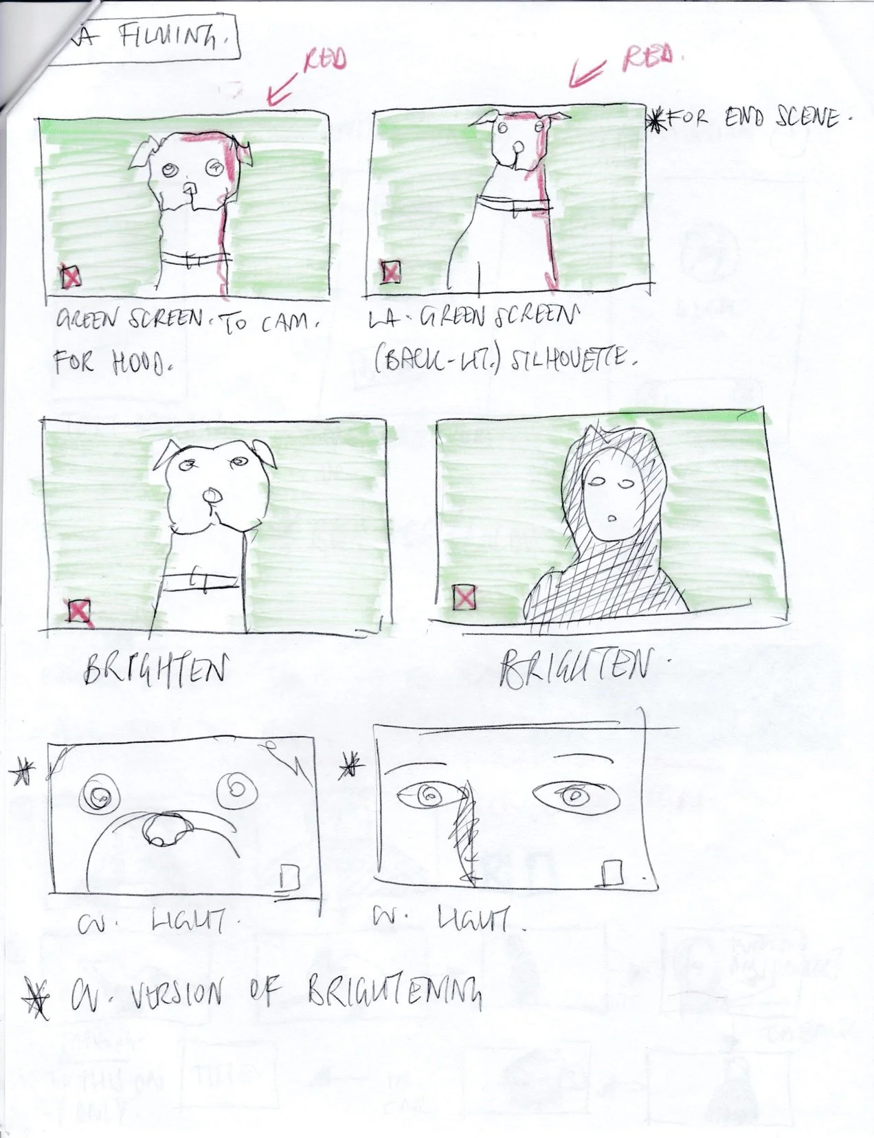
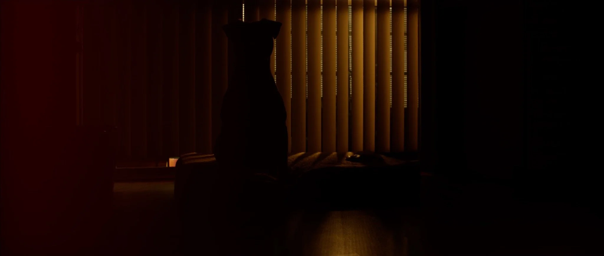
Written back in early 2021, “AN ACCIDENT” was conceived as my follow up to the award-winning “FLASH”. Maintaining the same tone and sense of seriousness that had been instilled in my work for the longest time, come 2022 and the years that had preceded it, I was welcomed by a large amount of reverence. With the amount of praise my previous film recieved, it followed the same pattern as much of my work. As time passed a becoming familiar with the pattern, the passion slowly diminished. Most of 2021 was taken up with attempting to carve out some opportunities for myself in the corporate sphere, applying for jobs across the country and unfortunately, those efforts did not come to fruition. Effectively, “AN ACCIDENT” accompanied a pile of scripts I had been developing. It wouldn’t be until late August of 2022, that I would decide to develop a script to shoot for the upcoming Horror Festivals coming in October. This new film was aiming to push the boundaries as far as it could. I had all the same elements as before (with the addition of a dog) to meld a suitable narrative to, only this time, it was going to be a bit more of a laugh. There was a deliberate rebellious attitude to the film, reflecting more a personal sense of frustration with my work. The seriousness of the tone within in the original drafts of the script was quickly replaced with irreverence. There was no way for me to get EXACTLY what I was looking for, well aware of what had transpired on previous film shoots, so I decided that any sense of quality or polish was unattainable which became strangely liberating. Deliberately ‘unlearning’ and negating certain techniques and adopting more of a low-fi, off-the-cuff attitude to some of the shooting (not all) would hasten the process of shooting and lend to the overall style and look of the film. This flew squarely against the ultra-micromanaged shoots that were planned to within an ‘ength’ of their existence but honestly, a sense of abandon helped. Now, that wouldn’t work in all cases obviously as it pertained to more of a ‘style-over-substance’ approach but, I would not be as disappointed if it became an unmitigated disaster. The original concept, some development notes even during production and continued development notes can be seen below. The original development notes and storyboards were a year old by the time I re-developed the concept and re-did the storyboards of which you can see further down the page.
Poster Reveal
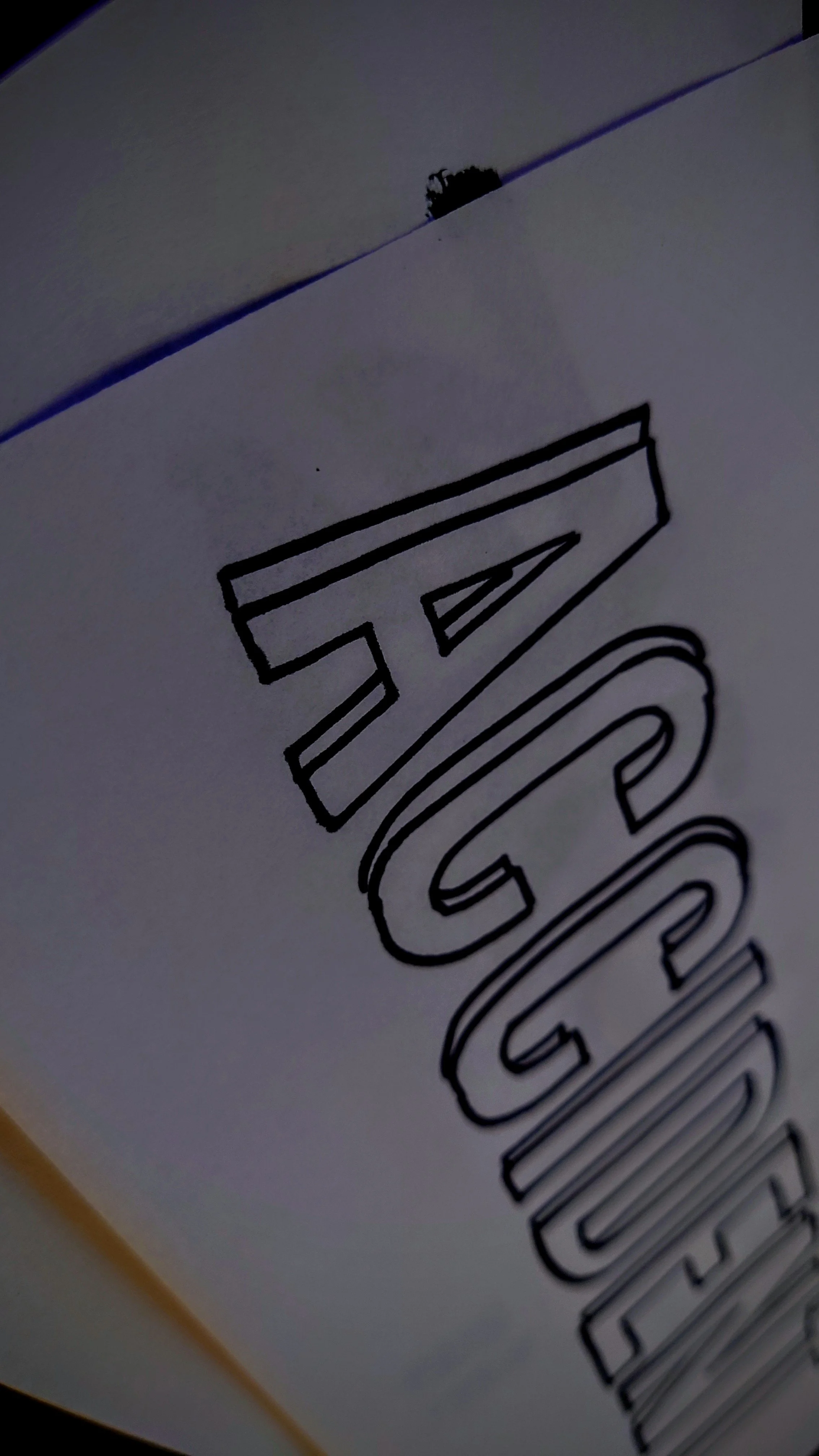
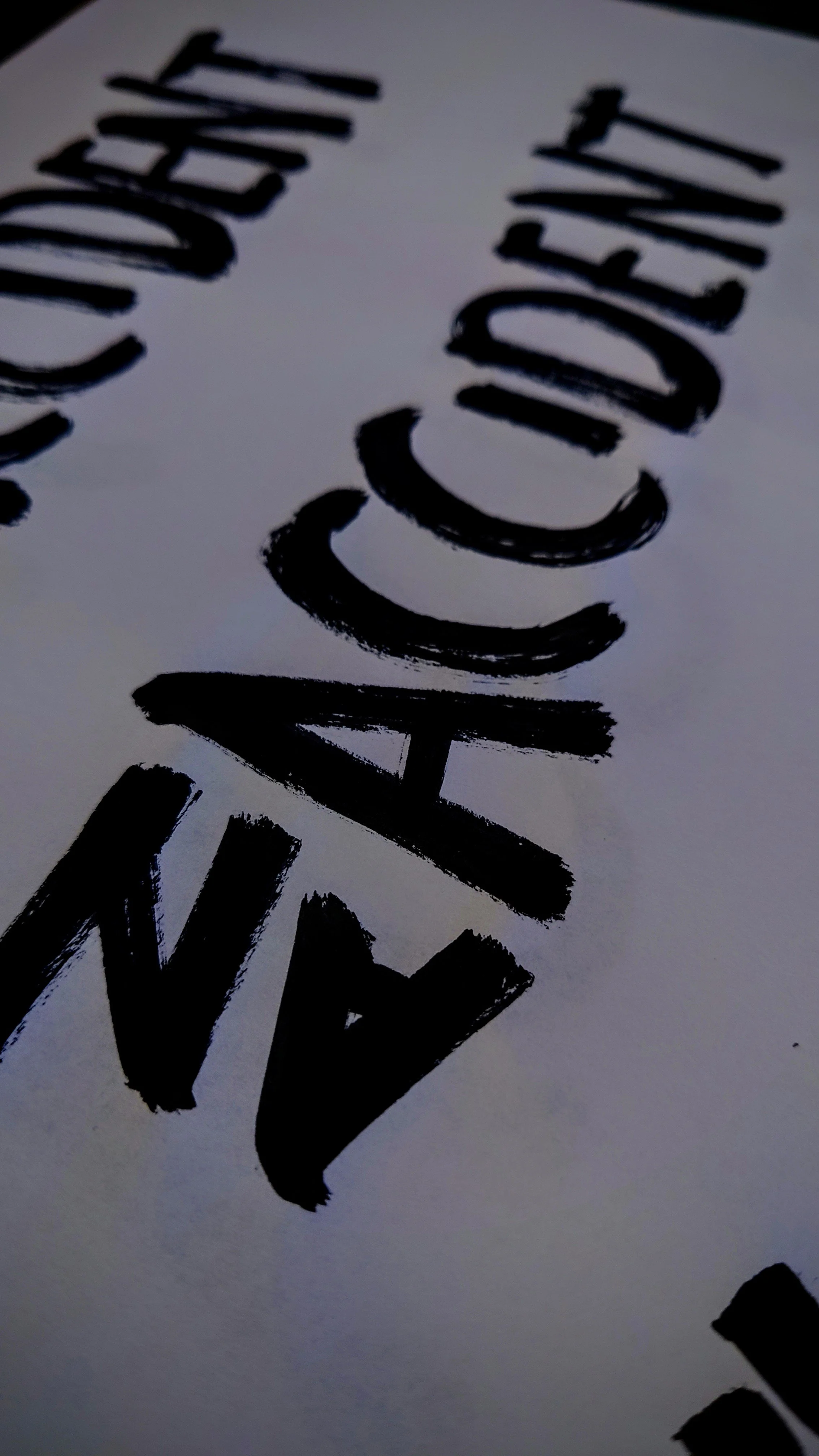
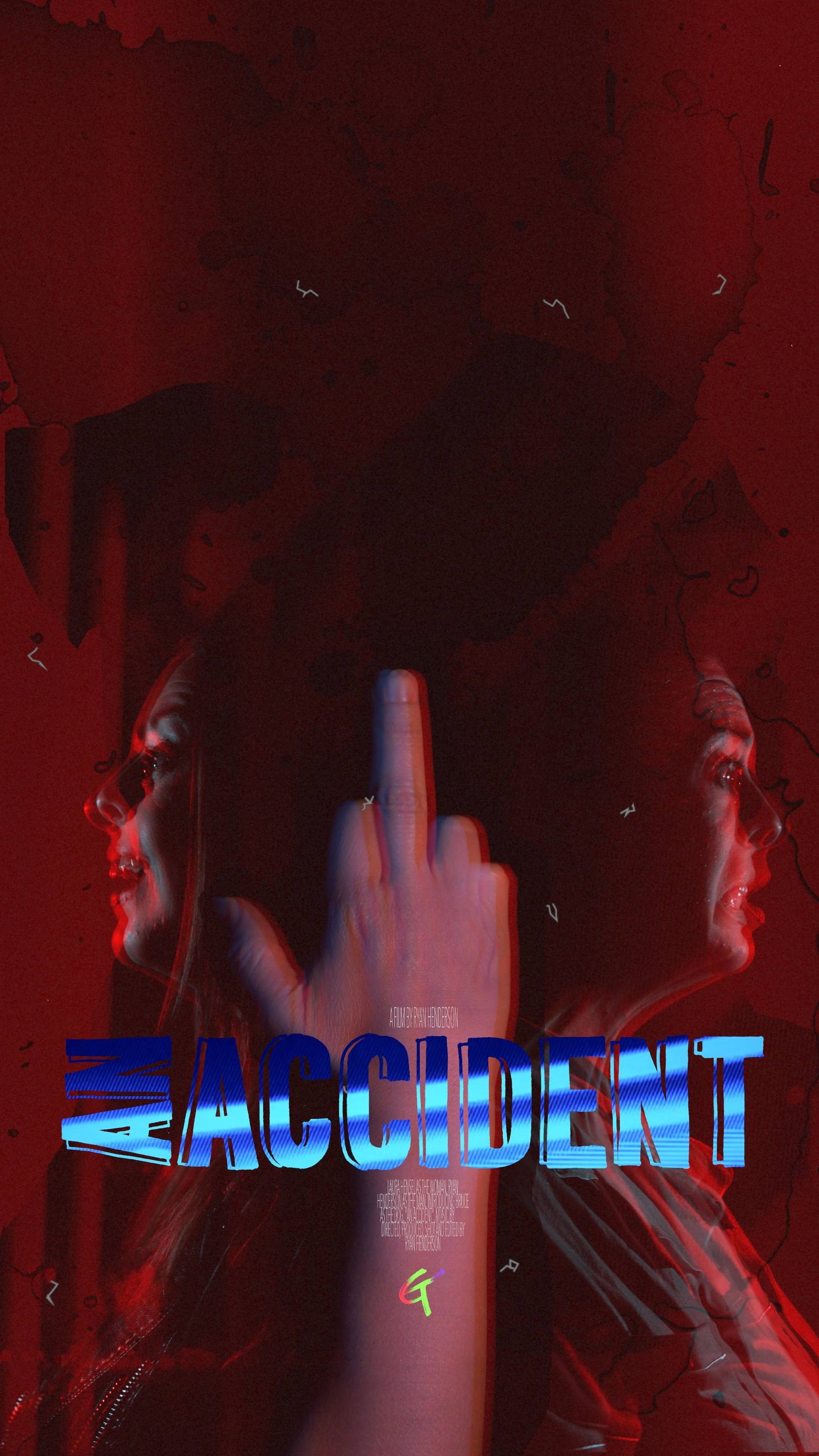
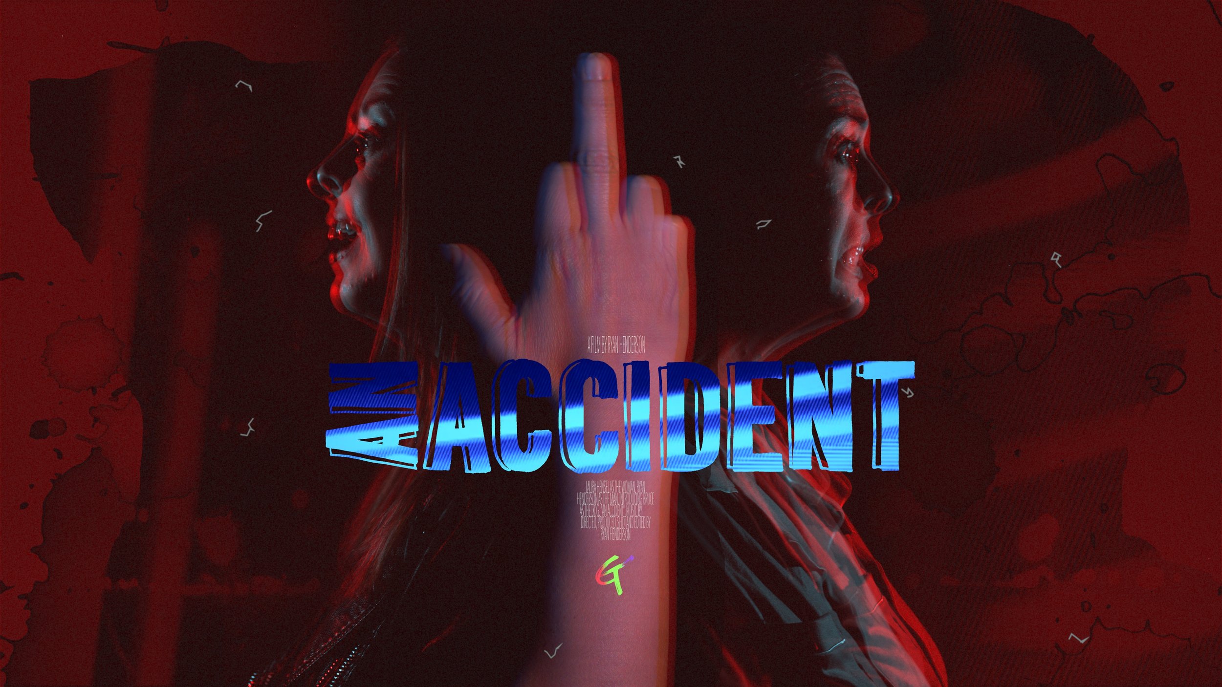
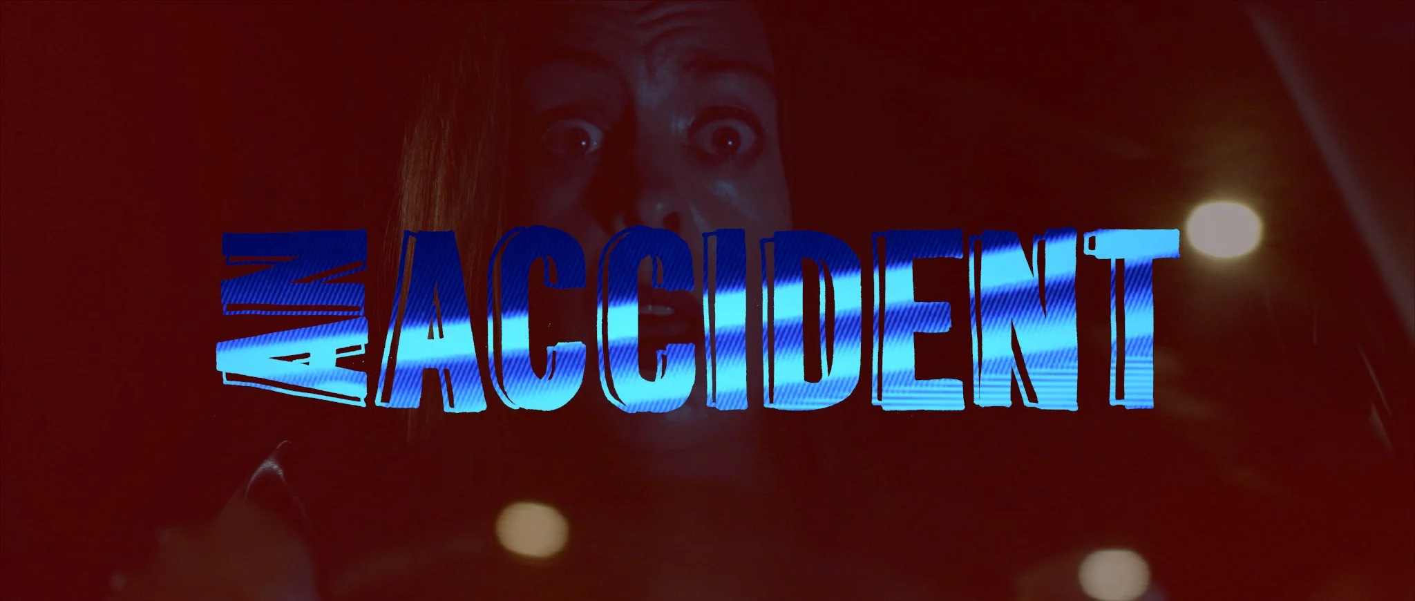
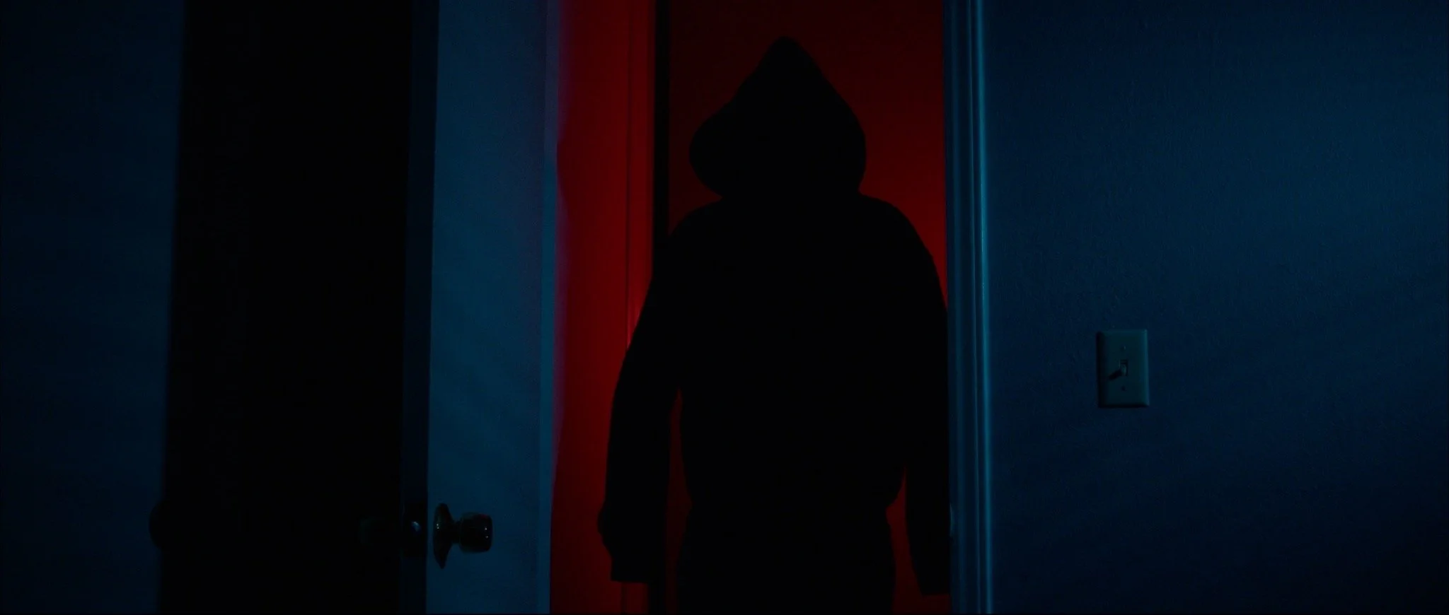
There was several designs for the posters through the course of the shooting of the film. There was originally going to be a fully illustrated poster (still a possibility when I have some spare time) drawn more like a ‘pop-art’ collage using stills from the film and some other extras similar to how I’ve illustrated the indents for the podcast, having more a deliberate cell-shaded and solarized look and feel. In the big scheme of things, it was going to be too time consuming and with the impending deadline, it was easier to go back to the well and get to the heart of what the film was about. What was settled on was the duality of the main character with references to other elements in the story (the man, the dog) without giving too much away. The title “AN ACCIDENT” already, is a little too ‘revealing’ as to the direction of the film but the emphasis was on the more gruesome ideas; the blood drops (unused shots from. music video from years back) and the hard red motif in the art design. From the landscape (16:9 and 23.9:1 anamorphic) and the portrait posters this stayed clear throughout. More than often anyway, the landscape posters are the most seen and end up being used as the template for the laurels when shared as the placeholder for the Vimeo upload.
Teaser Reveal
When it came time to reveal the teaser trailer, it had to reflect the tone and attitude of the film. Initially I didn’t want to create a teaser after the debacle of trying to get the film submitted in time. After the submission phase and the promotional aspects of this process started to become more pressing. After a litany of issues, including one of the bigger concerns being, the impending hurricane during the literal “final days” of the films process, the idea of making a teaser at that time wasn’t important. I certainly didn’t want to create something that followed the framework of familiarity either. I had been looking at old ‘grindhouse’ and 80’s film trailers and played with the idea of an old RTC with smoke and a domineering voiceover. With time more and more beginning to run away from me with the submissions schedule, what was eventually settled on was semi-animated with text pop-up’s showing a tale of the real-life Laura detailing how she’d seen the film and effectively ‘pirated’ the film and is willing to show the film to the audience out of excitement. The film shows at 6000% sped up and against another layered version of the same animation to hide any real details of the films story so that, in the obscure and unlikely event that someone might slow the teaser down to view the film in its entirety. More a reflection of the overall flippant tone of the film, it’s played similarly for laughs.
Director’s Notes
AN ACCIDENT is a horror film exploring the selfish need of self-preservation and owning up to your mistakes.
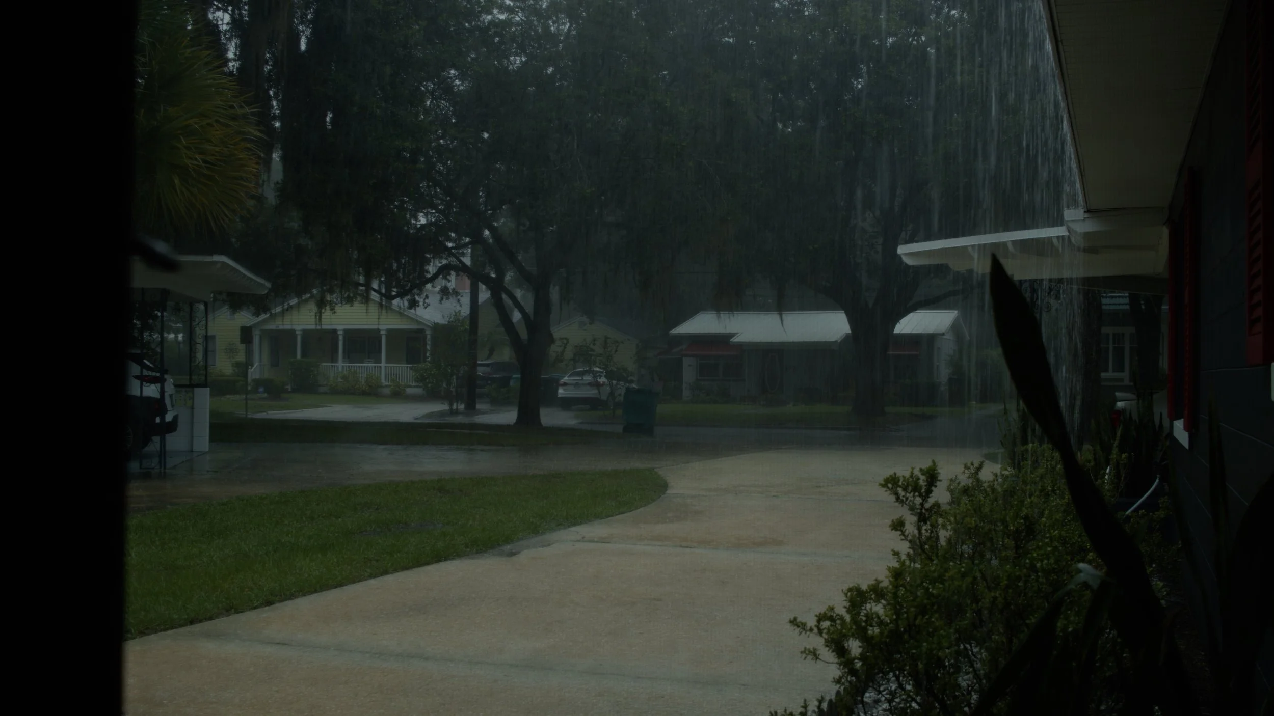
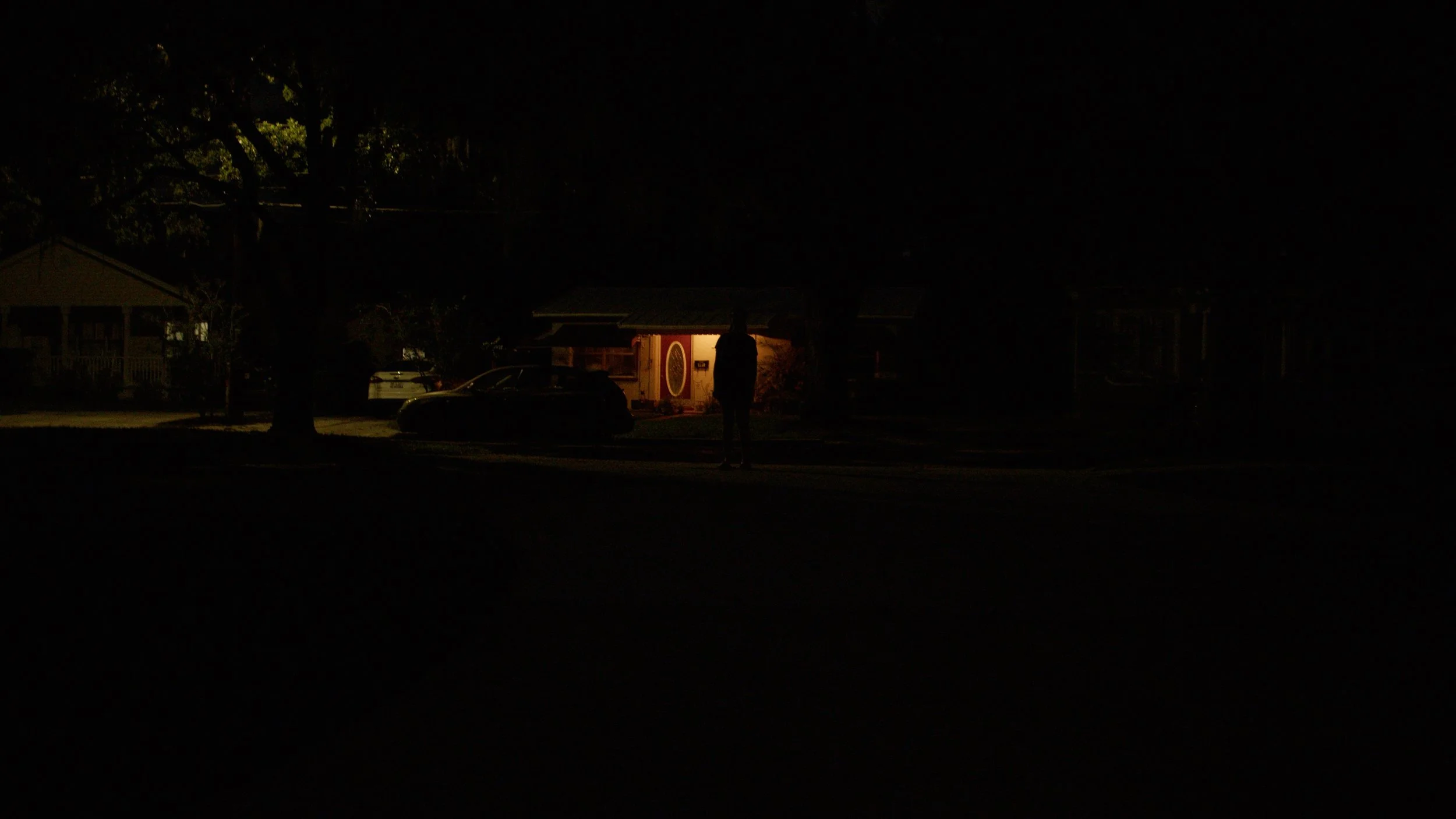
It is a comedic tale with horror and dramatic elements spanning tragedy and past mistakes into a farcical narrative about a selfish but deeply troubled person. Using more modern terminology and technology to depict an other-worldly and beyond realistic modern-day setting, this film looks at the world we live in now with less than favorable eyes. Intertwined into the fabric of the film is a rebellious nature and a real standing against conventions of quality melding a more music video style that cuts quickly and often to reflect the easily digestible media of the present time, focused on the lunacy of social media and misinformed video content. You're distracted, you're preoccupied, you're buried in your phone but it's fine, the real world sucks sometimes.
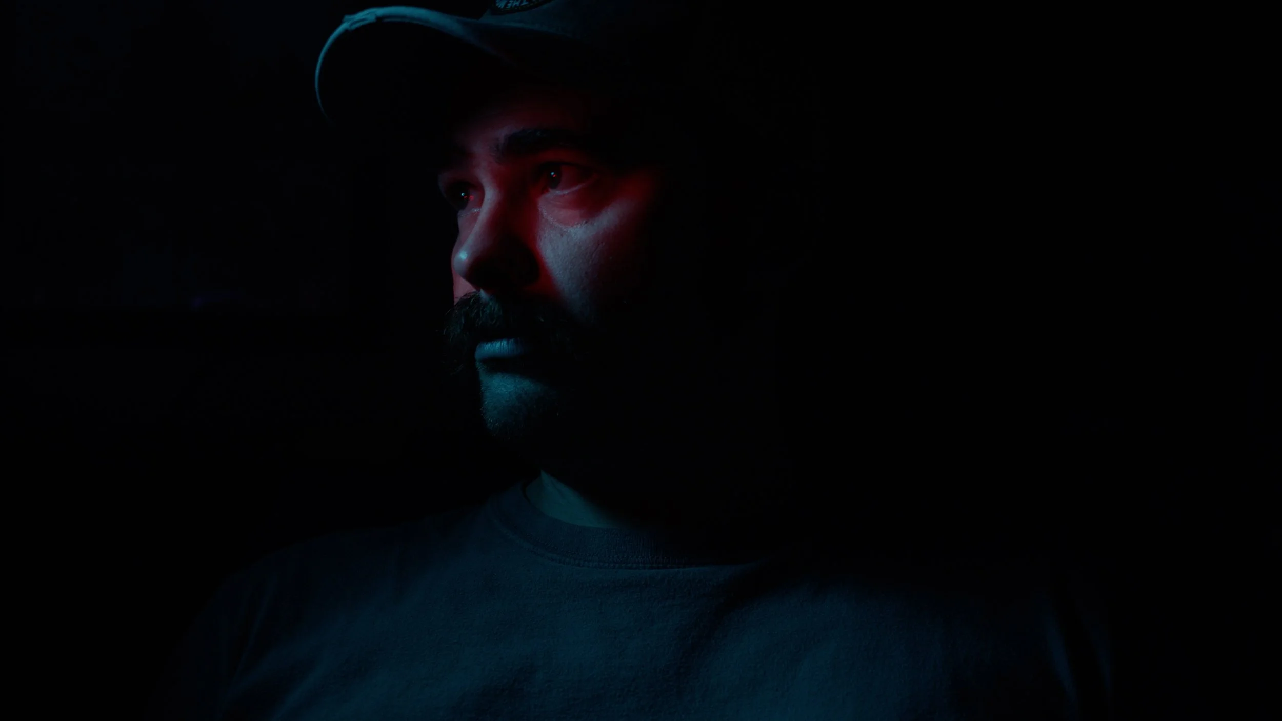
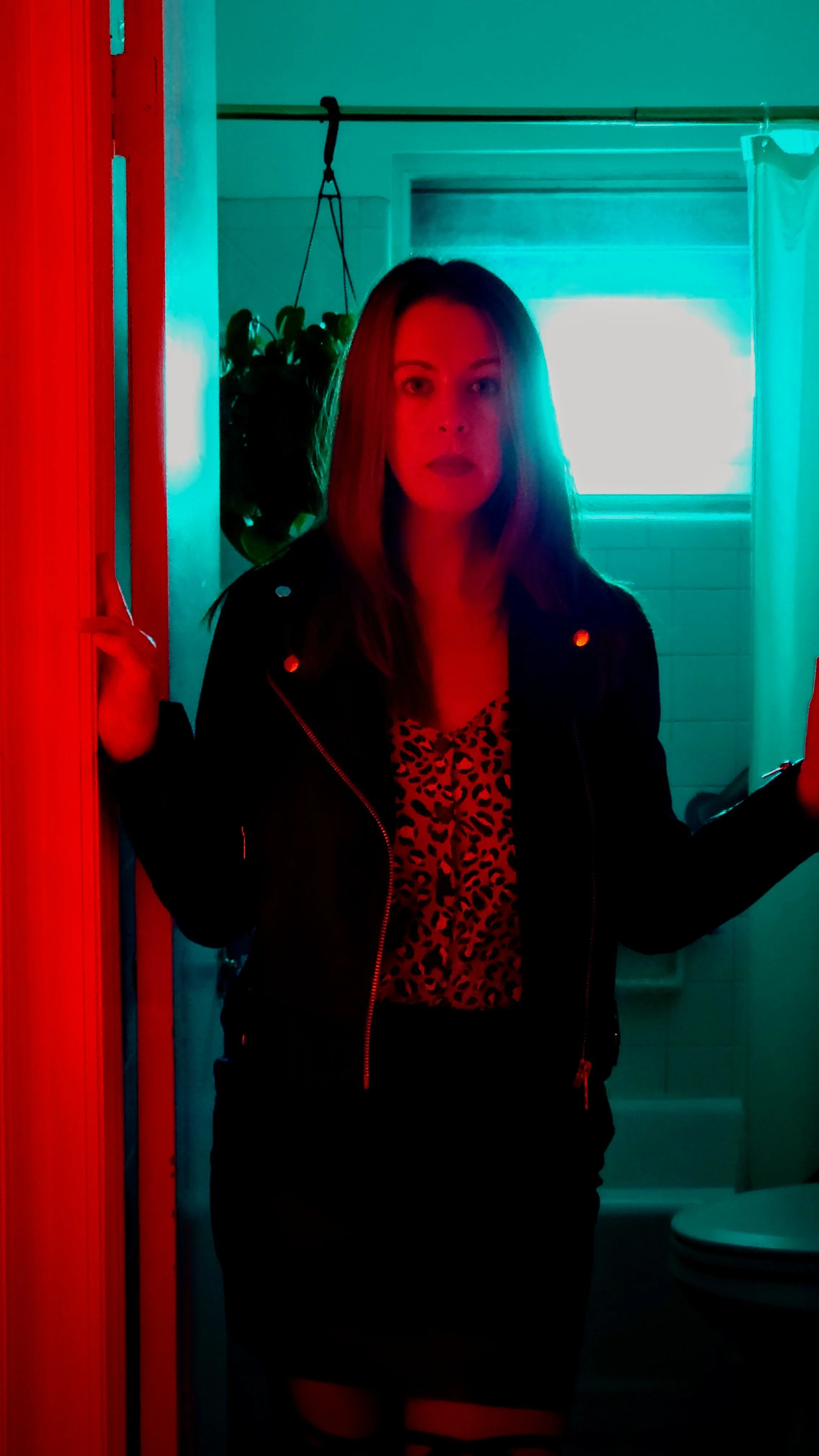
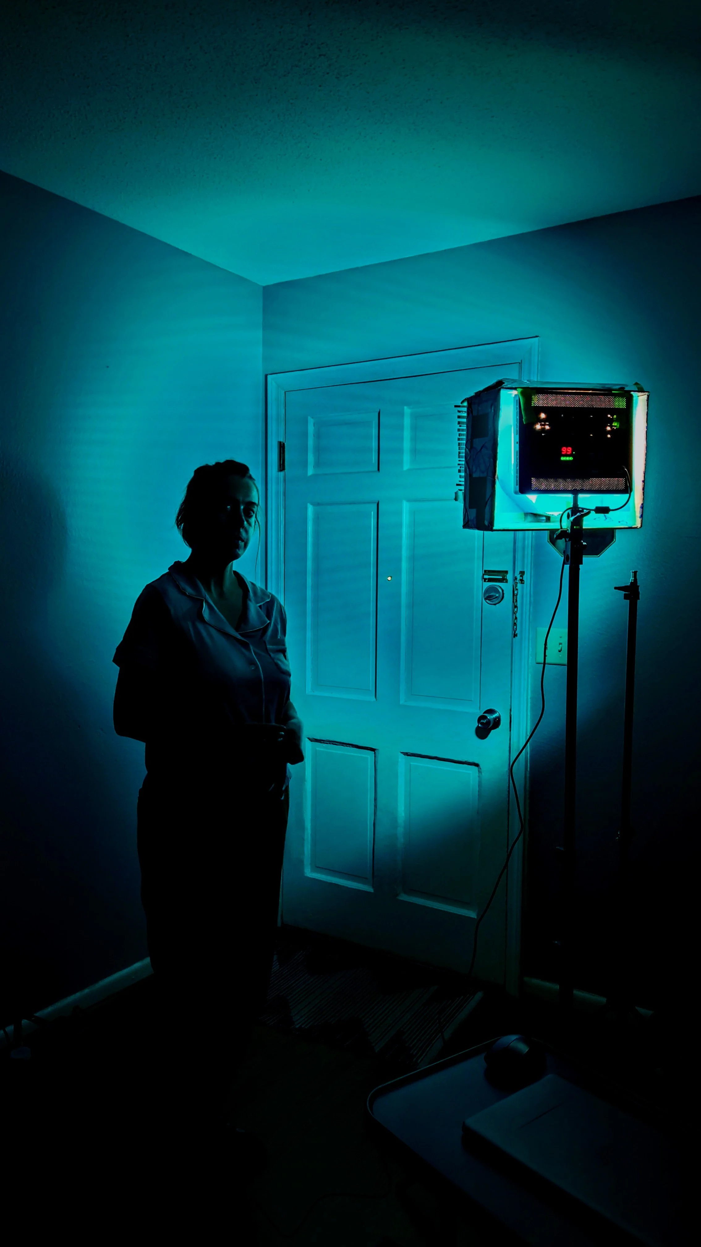
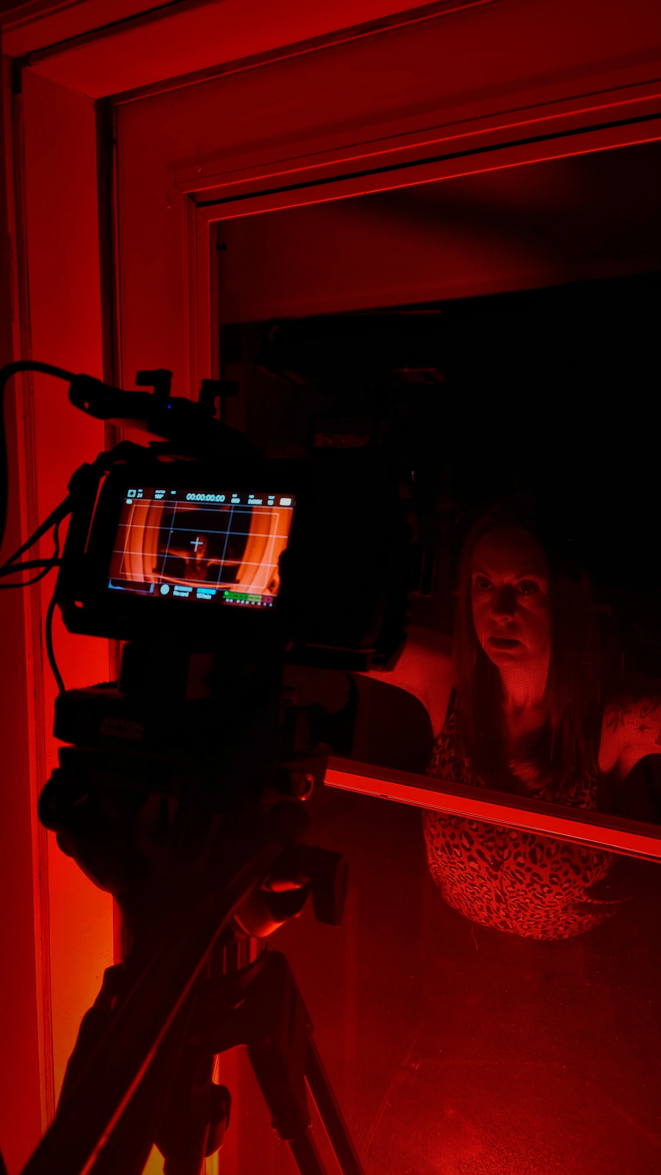
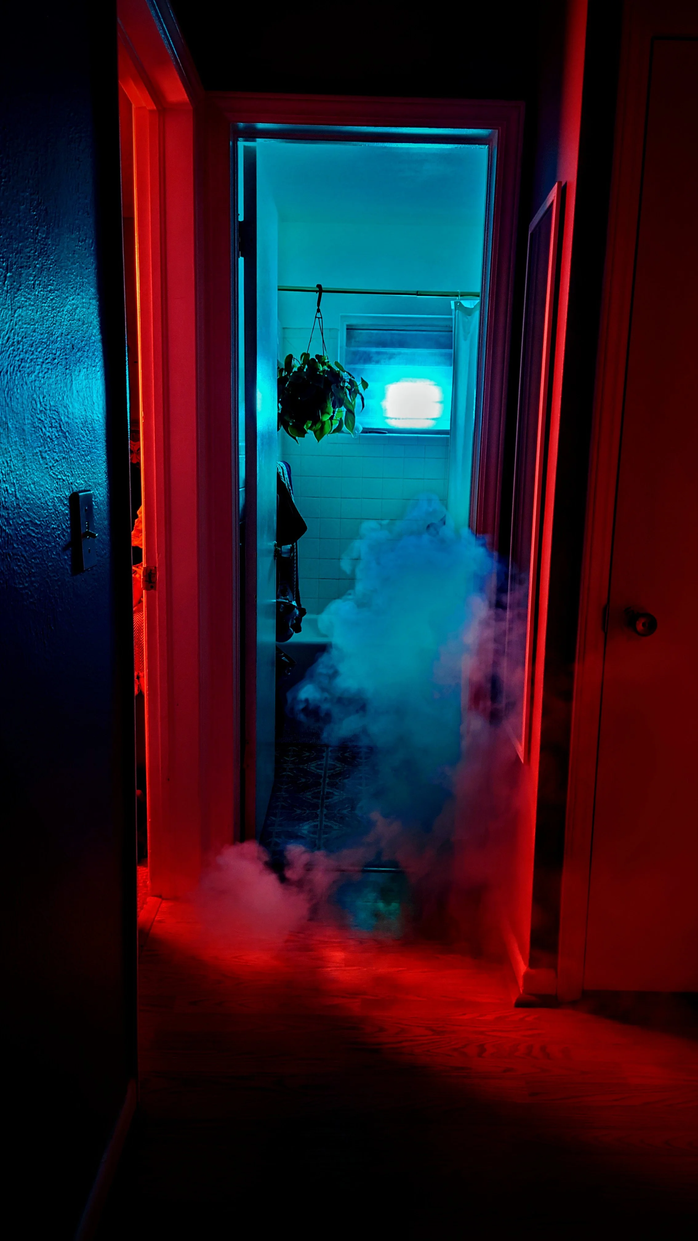
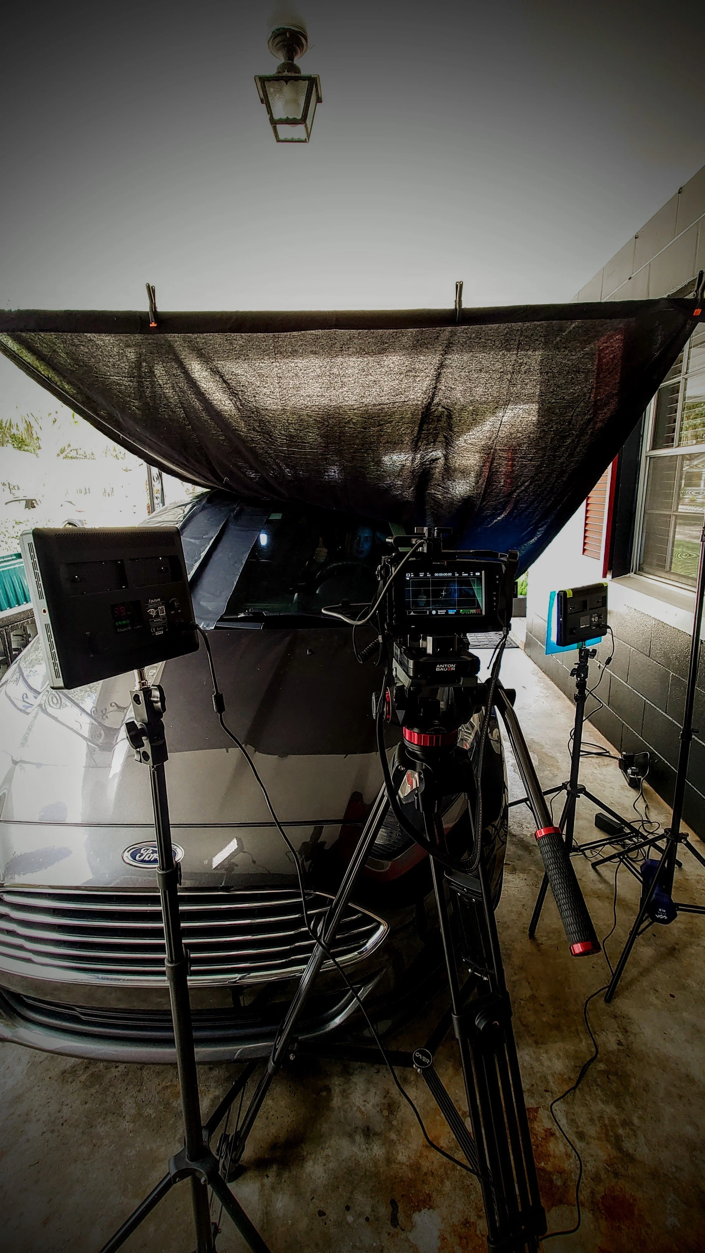
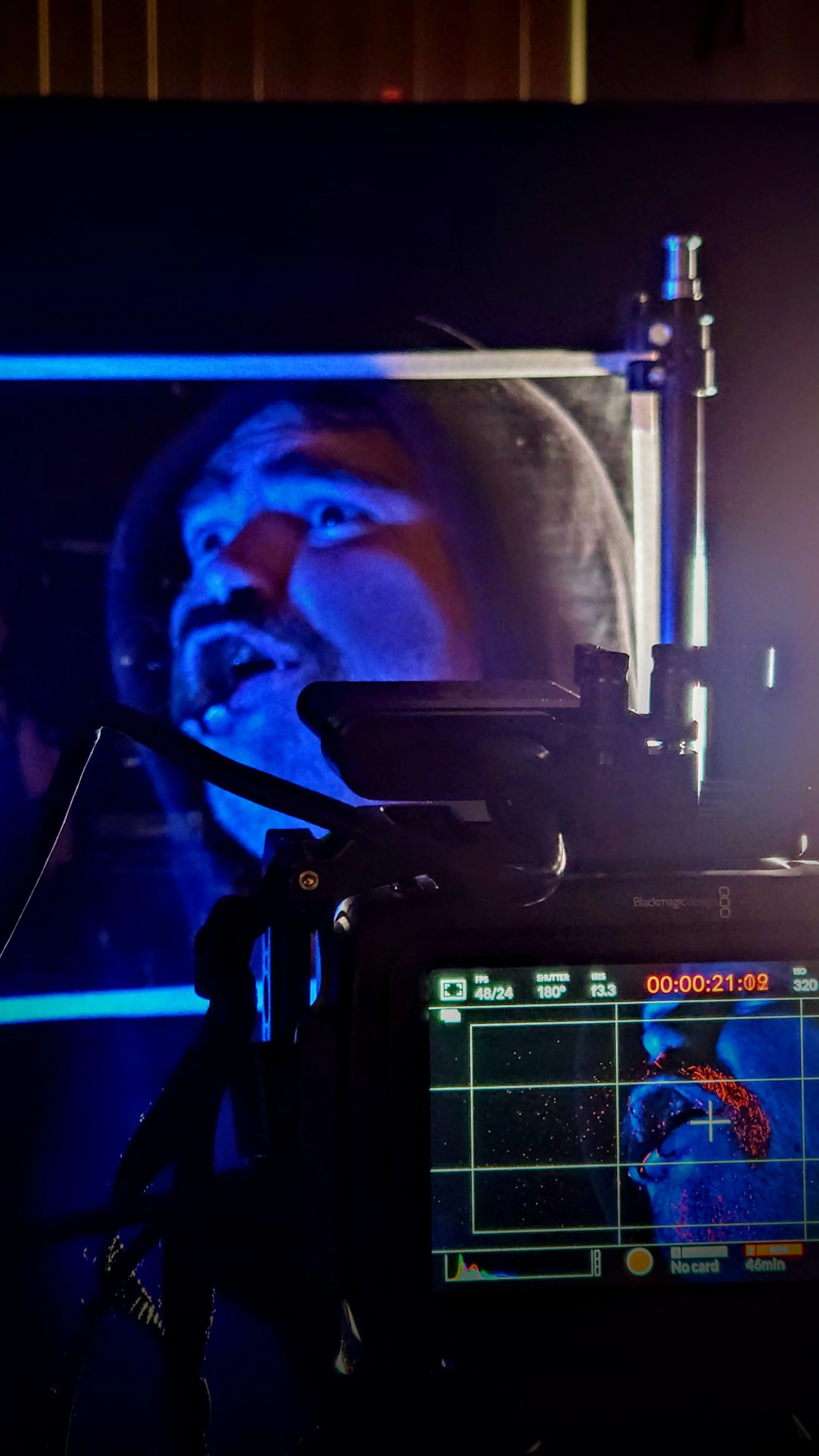
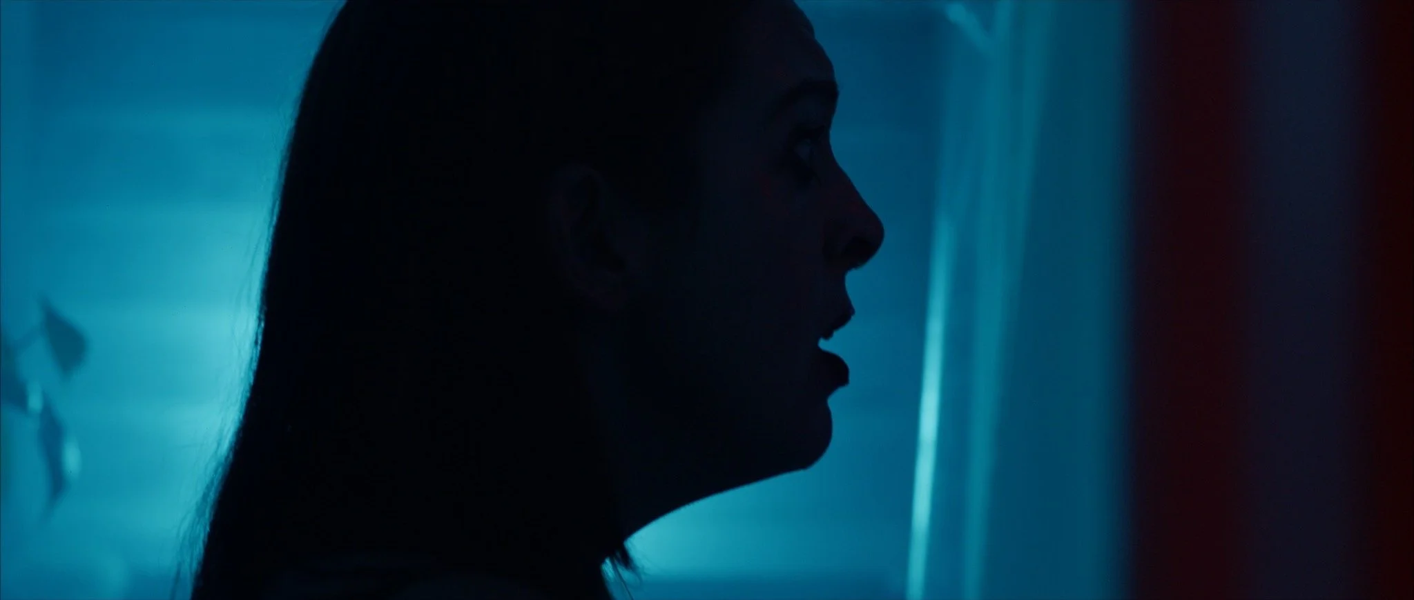
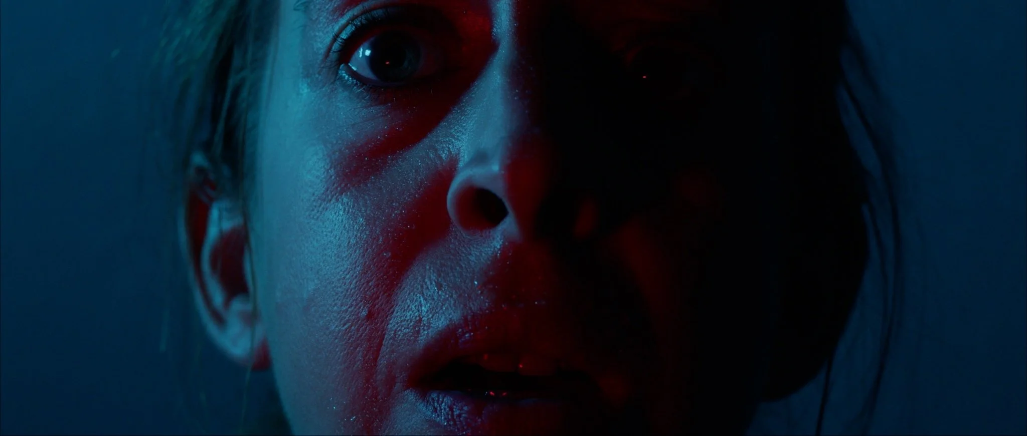
Inspired solely by the startling visual style of the films of Dario Argento and Lucio Fulci in the Giallo sub-genre of horror, the use of colour casts was to illustrate how her troubled past begins to creep up on her. Visual hints that harken back to the moment of the accident; strong red and blue colors within the car become the predominant visual style of the film when she arrives home. The idea that the colors reflect the trauma she is experiencing, that she can't escape from the consequences of her actions. This contrasts with the real-life memories of losing her dog to a similarly bizarre and tragic accident where the immediate response from the driver was to proclaim "it was only an accident", as if that alone voids any level of responsibility and airs of such a level of dismissiveness it would be construed as cruel. This is what drives the actions of this character.
The character's arc reflects someone who can't detach from the trauma they have experienced and will easily ignore the subject in question; the untimely death of the most important companion in her life, her dog. The horror here is that we can easily relate to the loss of someone special to us, more so, the loss of the unconditional love of a furry friend. It's the lowest of hanging fruit but to truly understand what is frightening, it becomes a personal exploration into what your worst nightmares might entail.


